






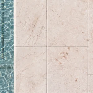
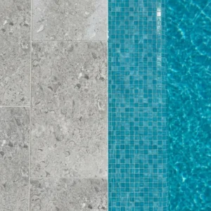
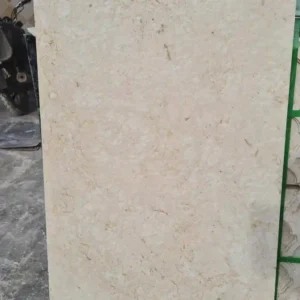
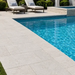
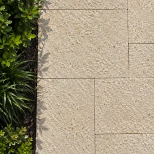
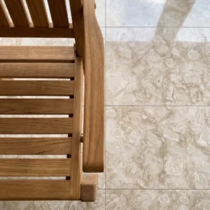
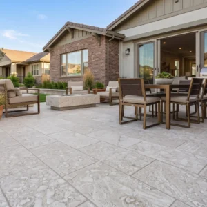
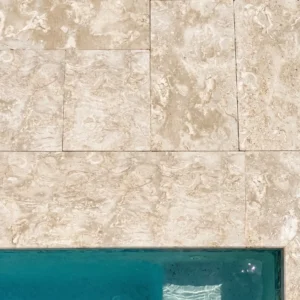
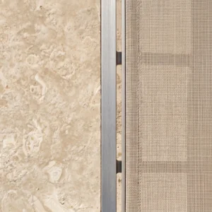
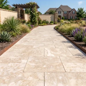
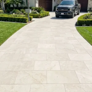
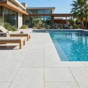
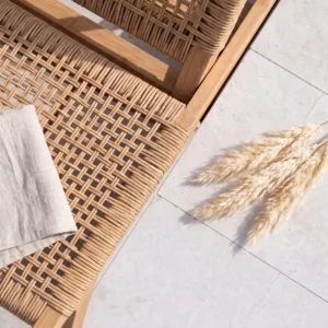
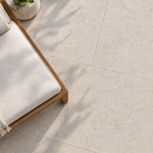
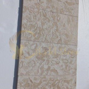

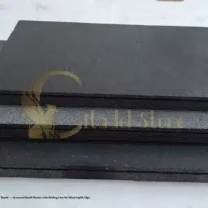
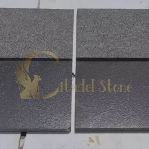
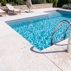
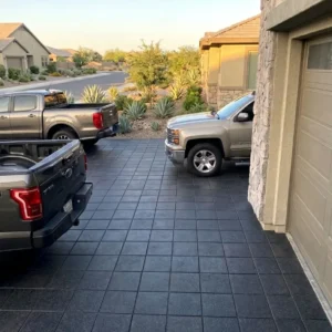
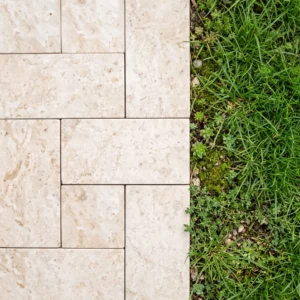
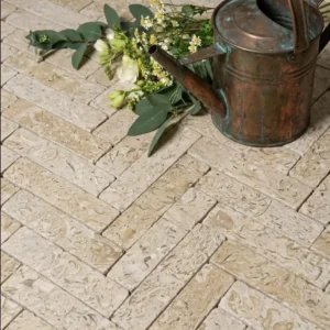
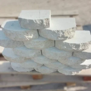
The single detail that separates a Travertine Pool Coping installation lasting 25 years from one failing at year eight is the relationship between coping-to-deck movement and the bond beam behind it. Travertine Pool Coping needs a slip joint at the coping-to-bond-beam interface, not a rigid mortar bed across the full width, because the pool shell and the surrounding deck move independently through seasonal cycles. You’ll see hairline cracks migrate straight through the coping stone when that movement gets locked in place. Getting this joint geometry right at layout is where a durable perimeter begins.
Why Travertine Performs at Pool Edges
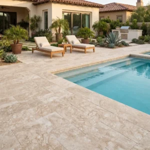
Travertine’s calcium carbonate structure keeps surface temperatures noticeably cooler than dense igneous stone under direct sun — the reason bare feet tolerate it in high-UV conditions where granite becomes uncomfortable. That same open-pore texture, rather than an aggressive flamed finish, is what governs the wet DCOF — confirm it against ANSI A326.3. According to Natural Stone Institute travertine performance data, the material’s absorption and pore geometry actively moderate surface heat, which is why it dominates residential pool perimeters.
The performance trade-off you need to respect is porosity. Travertine drinks water, and at a pool edge it faces constant saturation from splash-out plus chlorinated or salt-treated water. Your finish choice and sealing protocol determine whether that porosity becomes an asset for evaporative cooling or a liability for spalling.
- Surface temperature stays measurably lower than granite or basalt under identical sun exposure
- Open pores provide inherent traction when the deck is wet
- Filled and honed faces reduce absorption where splash-out is heavy
- Tumbled edge pool coping softens the perimeter profile and hides minor wear
- Freeze-thaw regions demand tighter attention to saturation and sealing than hot, dry climates
Color and Finish Options That Hold Up
Your color selection drives more than aesthetics — it affects surface temperature and how visible efflorescence becomes over time. Lighter tones read cooler underfoot and hide mineral bloom, while darker tones frame the water dramatically but run warmer. Citadel Stone stocks travertine pool coping tiles across the full tonal range so you can match deck field material without special order delays.
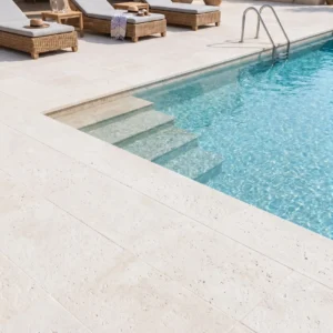
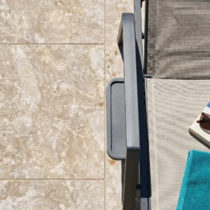
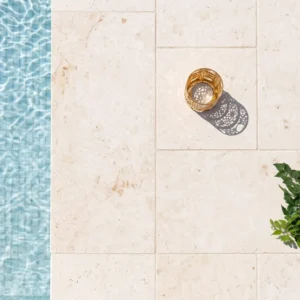
- Ivory travertine pool coping and white travertine pool coping deliver the coolest surfaces and the most forgiving look for efflorescence
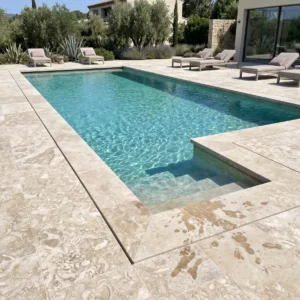
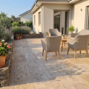
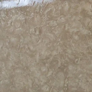
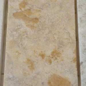
- Classic travertine pool coping brings warm cream-to-tan movement that suits most Mediterranean and transitional designs
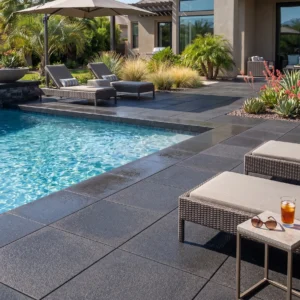
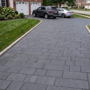
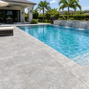
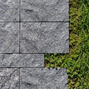
- Silver travertine pool coping and gray / grey travertine pool coping read modern and pair well with contemporary architecture
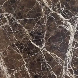
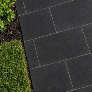
- Walnut travertine pool coping offers the richest, darkest banding for high-contrast perimeters
- Honed and filled faces cut absorption; tumbled faces maximize traction and a softer aesthetic
Here’s what most specifiers miss on finish: a bullnose travertine pool coping edge feels better to a swimmer gripping the perimeter than a sharp square arris, and it resists chipping where towels, elbows, and pool equipment make contact daily. Curved travertine pool coping cut to a radius handles freeform and radius-end pools where straight units would leave awkward mitered gaps.
Format and Thickness Selection
The format you choose changes both your labor cost and your joint count around the perimeter. Larger units mean fewer joints — fewer entry points for water and fewer places to fail. Your two workhorse formats are 12×24 travertine pool coping and 16×24 pool coping, and the choice usually comes down to deck scale and grip preference.
- 12×24 travertine pool coping suits standard rectangular pools and tighter radii with cleaner cuts
- 16×24 pool coping reduces joint density on larger perimeters and reads more substantial
- 2 inch travertine pool coping is the standard for a cantilever or bullnose profile carrying occasional point loads from foot traffic and pool furniture
- Thinner drop-face and remodel units exist but shift more load to the setting bed and bond beam
The detail that matters most on thickness: a 2 inch travertine pool coping stone gives you enough mass to machine a full bullnose travertine pool coping or a drop-face return without undercutting structural integrity. Go thinner and you lose the ability to profile the edge properly. You can request thickness specifications and sample tiles of travertine pool coping tiles from Citadel Stone before you commit a full pool’s worth of material.
Base Preparation and Structural Requirements
Base preparation and code compliance are where pool coping either earns its lifespan or forfeits it, and this is the part generic guides skip. Your coping sits on the bond beam — the reinforced top of the pool shell — and local building standards typically dictate the bond beam’s reinforcement, minimum width, and how coping loads transfer to it. Before you set a single stone, confirm your jurisdiction’s requirements for coping overhang, deck expansion joints, and any seismic detailing that applies in your region.
- Verify frost line depth in your area — in freeze-prone regions, the deck footing and any coping-supporting slab must extend below it to prevent heave lifting the perimeter
- Confirm bond beam width supports your coping’s overhang; a 1 to 1.5 inch overhang past the pool wall is typical for water management
- Detail an expansion joint between the coping and the concrete deck — never bond them rigidly
- In seismic zones, code often requires flexible sealant joints that let the deck and shell move without shearing the stone
- Slope the deck away from the coping at a minimum 1/4 inch per foot so water sheds off the perimeter, not into the joints
Field experience teaches a hard lesson here: when the coping is mortared solidly to both the bond beam and the deck slab, the differential movement between a water-filled shell and a sun-baked deck transfers straight into the weakest coping unit. You get a diagonal crack within a few freeze-thaw cycles. Detailing that slip joint and honoring the frost line aren’t optional refinements — they’re what keeps your perimeter intact through the code-mandated structural life of the deck.
Setting, Jointing, and Sealing
Your setting bed and jointing protocol for travertine differ from concrete pavers because the stone’s absorption pulls moisture from the mortar. Use a polymer-modified thinset rated for exterior wet applications, and back-butter each coping stone to eliminate voids that trap water beneath the unit. Voids under travertine are where freeze damage and efflorescence begin.
- Back-butter every coping unit to achieve full coverage — voids beneath the stone hold water and drive spalling
- Use a non-sanded, exterior-grade grout in tight joints; sanded grout in wider joints depending on your format
- Seal with a penetrating, breathable sealer — never a topical film that traps moisture inside the stone
- Reseal every 18 to 24 months in heavy-use or high-UV conditions; less often in mild, dry regions
What often gets overlooked is the sealing window. You should seal travertine after it has fully cured and dried, not immediately after grouting — sealing damp stone locks in moisture and defeats the purpose. For projects sourcing complementary perimeter and deck stone, travertine pool coping colors covers color matching across coping and field units so your sealing schedule stays consistent site-wide. Getting the material dry before the first seal coat prevents the cloudy, blotchy finish that plagues rushed jobs.
Slip Resistance and Safety Detailing
Slip resistance at a pool edge isn’t a nicety — it’s a code and liability concern, and travertine gives you a natural advantage most stone can’t match. The material’s pore structure breaks the water film that makes polished surfaces treacherous when wet. Even so, your finish selection determines whether you clear accepted safety thresholds.
Industry testing frameworks measure static coefficient of friction to gauge how a surface performs wet. Per ASTM slip resistance test methods, wet-condition friction is the metric that matters at a pool perimeter, and a tumbled or honed travertine face typically outperforms a polished stone in that scenario. Specify a tumbled edge pool coping or honed face where barefoot traffic is constant, and reserve highly filled, smoother finishes for lower-splash zones.
- Tumbled and brushed faces deliver the best wet traction for high-traffic pool edges
- A bullnose or rounded profile gives swimmers a secure grip at the waterline
- Avoid film-forming sealers that can leave the surface slick when wet
- Confirm your local pool code’s surface requirements before finalizing the finish
Maintenance and Long-Term Performance
Long-term performance of travertine pool coping tiles comes down to two habits: keeping the sealer current and managing the water chemistry that contacts the stone. Salt systems and aggressive chlorine both accelerate surface etching on carbonate stone, so you’ll want balanced water and prompt rinsing of splash-out zones. Field data across varied climates shows well-sealed travertine holding its integrity two decades and beyond.
- Rinse salt and chlorine splash-out regularly to slow surface etching
- Reseal on schedule — a lapsed sealer is the leading cause of premature staining and efflorescence
- Address any lifted or drummy stone immediately before water infiltrates the setting bed
- Keep deck expansion joints filled with flexible sealant, not hardened debris
You can expect 20 to 30 years of service from a properly detailed and maintained perimeter, with biennial resealing and functioning drainage. The failures we see in the field almost never trace to the stone itself — they trace to a locked expansion joint, a missed sealing window, or a bond beam detail that ignored the frost line.
Sourcing and Batch Consistency
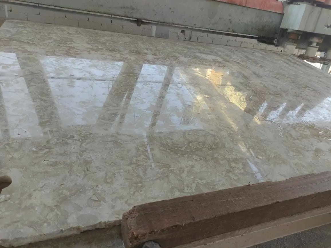
Batch consistency is the sourcing variable that separates a seamless perimeter from a patchwork one. Travertine is a natural material, so tonal range and vein character shift from quarry block to quarry block — order short and you risk a visible mismatch when you go back for more. At Citadel Stone, we inspect each batch at the warehouse for tone and thickness consistency before it ships, precisely because a mid-project color break is nearly impossible to hide at a pool edge.
- Order your full perimeter quantity plus 10 to 15 percent overage in a single batch
- Sourced from our selected premium quarries, each batch is checked for tonal and dimensional consistency
- Confirm warehouse stock levels before locking your installation date
- Request samples to verify color against your deck field material before the truck is loaded
Our nationwide warehouse inventory typically shortens lead times to 1 to 2 weeks versus the 6 to 8 week import cycle many projects face. That buffer matters when your deck pour and coping set are sequenced tightly and a delayed truck stalls the whole crew.
Buy Travertine Pool Coping from Citadel Stone Nationwide
Citadel Stone stocks Travertine Pool Coping in standard formats including 12×24 travertine pool coping, 16×24 pool coping, and 2 inch travertine pool coping in bullnose and drop-face profiles. You can buy across the full color range — ivory travertine pool coping, white travertine pool coping, classic travertine pool coping, silver travertine pool coping, gray / grey travertine pool coping, and walnut travertine pool coping — with tumbled, honed, and filled faces available to match your deck and safety requirements. Compare the affordable, cheap options against import pricing and you’ll usually find domestic stock lands closer to budget once freight is factored in. For projects needing custom cuts, curved travertine pool coping for radius pools, or non-standard formats, Citadel Stone’s team can advise on lead times and confirm current warehouse availability. Request samples or thickness specifications before you commit, and ask about trade and wholesale pricing for larger perimeters. As you plan the broader perimeter, related deck material informs your coping choice — travertine pool deck options for patios covers the field-paving side of the same Citadel Stone project scope. Reach out for a quote, nationwide delivery scheduling, or a consultation on your specific pool geometry. Contractors specify Travertine Pool Coping from Citadel Stone, a limestone with a distinctive naturally banded texture, for residential and commercial sites.
See also: travertine bullnose pool coping.
Related guides: gray travertine pool coping · scabos travertine pool coping · travertine tile install · black and white pool tile · Travertine Coping Heat Comparison: Ivory vs Gray vs Silver · How to Lay Travertine Tile Around a Pool Deck.