
Why Color Decisions Define Pool Coping Performance
Travertine pool coping colors do far more than set a visual tone — they directly influence surface temperature, glare management, and long-term maintenance demands in ways that most buyers don’t fully account for until after installation. The spectrum runs from soft ivory and classic silver-grey through warm walnut, golden honey, and deep espresso tones, and each sits at a different point on the heat absorption and reflectivity curve. Understanding how pigmentation interacts with travertine’s open-pore microstructure gives you a genuine specification advantage before you commit to a pallet.
The calcium carbonate matrix in travertine responds to UV exposure differently depending on iron oxide concentration — the primary driver of color in most commercial grades. Lighter tones with minimal iron content reflect a higher proportion of incoming solar radiation, while darker walnut and espresso variants absorb and retain more thermal energy. According to ASTM C1527 travertine dimension stone standards, thermal expansion coefficients for travertine average around 4.7 × 10⁻⁶ per °F — a figure that holds relatively consistent across color variants, but one whose real-world effect on surface temperature is amplified significantly by color absorption rates.
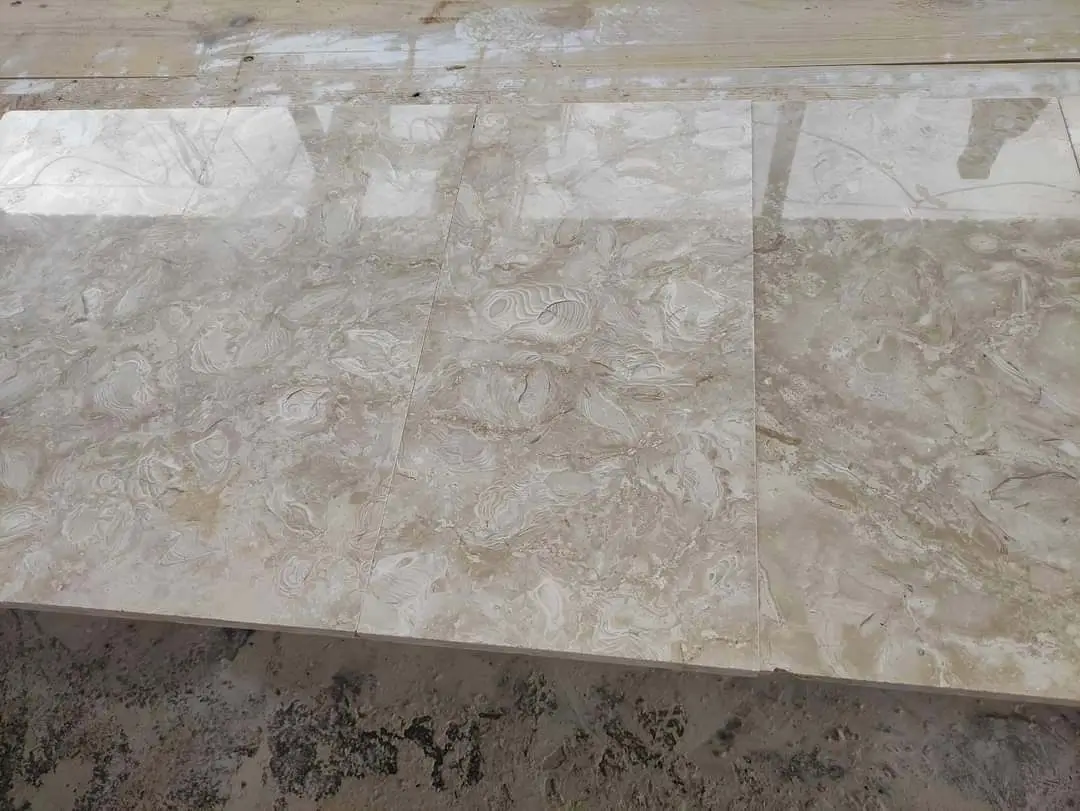
The Core Color Families and What They Deliver
Travertine’s commercially available color palette breaks into four primary families, each with distinct performance and aesthetic characteristics worth understanding before you specify.
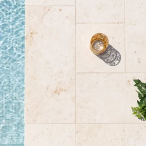
- Ivory and Classic Ivory: The lightest tones in the travertine spectrum, these grades reflect 60–70% of incident solar radiation. Barefoot comfort on exposed pool decks is significantly better than darker alternatives — surface temperatures typically run 15–25°F cooler than walnut tones under equivalent direct sun exposure. The trade-off is that mineral staining from pool water chemistry shows more readily on light-toned surfaces, requiring more consistent maintenance attention.
- Silver and Silver-Grey: Mid-range reflectivity with a cooler, more contemporary aesthetic. These tones integrate particularly well with modern minimalist pool designs — clean lines, concrete surrounds, and dark-water infinity pools benefit from the contrast. Thermal performance sits between ivory and walnut, with surface temps running roughly 10–15°F warmer than ivory under peak sun.
- Walnut and Noce: Rich brown tones with higher iron oxide saturation. Walnut travertine pool coping absorbs more heat and retains it longer after direct sun exposure ends — relevant in settings where early morning or late afternoon pool use is common. The warmer color palette suits Mediterranean, Spanish colonial, and earth-toned landscape schemes naturally.
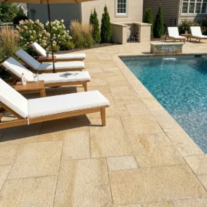
- Gold and Honey: Amber-yellow tones that sit between ivory and walnut on both the aesthetic and thermal spectrum. They pair well with warm-toned exterior masonry, desert xeriscaping, and sandstone architectural elements. Their mid-reflectivity profile makes them a practical compromise for buyers who want warmth without the heat retention of darker walnut grades.
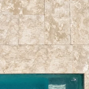
- Mixed or Vein-Cut Blends: Some premium grades expose cross-sections of vein patterns, producing high visual movement with color variation within a single tile. These work well as feature accents or in projects where the goal is visual richness over strict color uniformity.
Each color family is available in standard finishes — tumbled, brushed, honed, and chiseled edge — and finish choice modifies both the tactile surface and the perceived color depth. A honed ivory reads distinctly cooler and crisper than a tumbled ivory, even though the base material is identical.
Surface Finish and Color Interaction
The finish you select amplifies or softens the apparent color considerably, and this is where many specifications go slightly off-target. Tumbled travertine, with its rounded edges and textured face, diffuses light rather than reflecting it directly — this makes colors read warmer and earthier than they appear on a flat slab sample. Honed finishes, by contrast, create a more reflective surface plane that reads truer to the raw stone color. Brushed finishes occupy the middle ground, adding tactile texture without the heavy rounding of tumbled profiles.
For pool coping specifically, the finish also drives the slip resistance specification. According to PHTA pool deck safety standards, coping surfaces adjacent to water require a coefficient of dynamic friction (CODB) of at least 0.60 under wet conditions. Tumbled and brushed finishes typically exceed this threshold without additional treatment. Honed surfaces on lighter ivory grades may require a light acid etch or anti-slip additive in the sealer to reach code compliance — particularly in high-traffic pool environments.
The practical implication: don’t finalize your travertine pool coping colors selection based on a dry, honed showroom sample. Request a tumbled or brushed sample in the same color family before committing, and view it both wet and dry under natural light conditions.
How Landscape Style Shapes Travertine Color Selection
Color selection rarely happens in isolation — your pool coping sits within a broader landscape context, and the most successful specifications account for that relationship deliberately. The color of the travertine coping anchors the visual palette for everything adjacent: decking, planting schemes, exterior wall finishes, and water features all read against it.
For desert xeriscaping environments — gravel beds, agave plantings, and adobe-toned exterior walls — gold and honey tones create a seamless tonal bridge. The warm amber picks up the ochre and rust in native planting schemes without competing with them. Walnut tones can work here too, though the darker base color against pale gravel can create contrast that reads visually heavier than most desert-style schemes call for.
Tropical planting schemes with dense green foliage and bold flowering plants benefit from the contrast that ivory and silver-grey travertine provides. The lighter coping reads cleanly against lush green backgrounds and reinforces the high-contrast, resort-style aesthetic that most tropical pool designs aim for. Gold tones tend to disappear into warm-toned foliage rather than anchor the design.
- Modern minimalist pools: Silver-grey and ivory travertine coping reads cleanest against concrete, glass, and dark-water pools — the cooler tones support the restrained aesthetic without visual competition
- Traditional colonial and Mediterranean styles: Walnut and gold travertine pool coping integrates naturally with terracotta, warm-toned brick, and clay tile rooflines — the palette harmony is immediate and low-effort
- Transitional and contemporary styles: Ivory with a brushed or vein-cut finish provides enough visual movement to interest the eye without disrupting the clean lines typical of transitional design
- Naturalistic or woodland settings: Walnut and mixed-vein grades echo the tonal variation of natural stone outcroppings and blend more naturally into informal planting schemes
At Citadel Stone, we’ve observed consistently that buyers who review color samples against actual site materials — wall paint, decking, and surrounding hardscape — make significantly fewer color change requests than those who select from samples alone in a showroom setting. Pulling samples into natural light on-site before finalizing is a step worth building into every specification timeline.
Installing Travertine Pool Coping: Color Consistency Across the Run
One of the more frustrating field problems with installing travertine pool coping is managing color variation across a large run. Natural stone is quarried in batches, and even within a named color family — ivory, walnut, or gold — individual tiles vary in shade, vein intensity, and fill pattern. A pool coping run of 200 linear feet sourced from two different production batches will show a visible color shift at the transition point, and there’s no corrective measure once the material is installed.
The specification-level fix is straightforward: source your entire pool perimeter from a single warehouse batch with matching lot numbers. Verify with your supplier that the full quantity is available in one pull before your project schedule commits to a pour date. Citadel Stone maintains national warehouse inventory that allows full project quantities to be confirmed and reserved in advance — this eliminates the batch-mismatch risk that plagues projects sourced piecemeal from multiple distributors.
Beyond lot consistency, shade-blend the tiles before installation by drawing from multiple boxes simultaneously and dry-laying a 15–20 piece section before setting. Natural travertine variation is expected and part of the material’s character — the goal isn’t uniformity, it’s an even distribution of variation across the run rather than clusters of dark or light tiles that create an unintended pattern.
Account for how wet versus dry color reads during installation. Travertine pool coping colors shift noticeably when wet — ivory grades darken by roughly 20–25%, and walnut tones deepen considerably. This is normal behavior for a porous calcium carbonate material, and it typically moderates after sealing. However, if you’re previewing dry-lay samples alongside the pool water and tile finish, be aware that the final sealed appearance will sit between the dry and saturated states — not at the extreme of either.
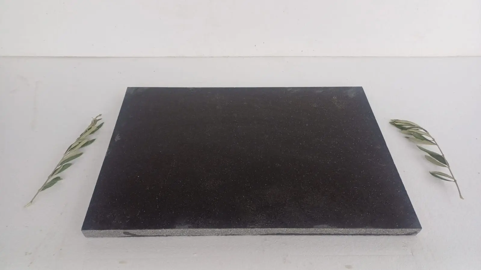
Travertine Tile Layout and Color Distribution
Travertine tile layout decisions interact with color selection in ways that affect the finished appearance significantly. A running bond pattern — where each tile offsets by half a unit — distributes color variation more evenly across the surface than a stacked joint layout, because no two adjacent tiles share the same positional relationship across the run. For color-variable grades like walnut or mixed vein-cut, running bond is almost always the right call.
Stacked joint layouts, popular in modern minimalist applications with silver-grey and ivory grades, require more careful shade selection during dry-lay because the eye naturally follows the continuous grout lines and any color clustering becomes immediately visible. The cleaner the layout geometry, the more exacting the color distribution needs to be.
- For ivory and silver-grey grades in stacked joint layouts: dry-lay at least 25 tiles before setting, redistributing any tiles that read noticeably lighter or darker than adjacent units
- For walnut and gold grades in running bond: the natural variation in darker tones distributes more forgivingly — a 15-tile dry-lay check is typically sufficient
- For mixed or vein-cut grades: allow for 8–12% additional material over net area to accommodate directional selection — high-movement tiles work better as accents or feature positions than as field tiles
- Joint width should be held consistently at 3/16 inch for honed and brushed finishes, widening to 1/4 inch for tumbled profiles where edge rounding creates natural variation in the apparent joint
When planning a travertine tile layout for adjacent bathroom or interior applications using the same color family, the layout logic shifts — interior tile is typically specified at smaller formats (12×24 or 18×18) compared to exterior pool coping, and the color reads differently under artificial light than under direct sun. Don’t assume visual continuity between interior and exterior samples from the same lot without reviewing both under their actual lighting conditions.
Sealing and Long-Term Color Retention
Travertine’s open-pore structure, which contributes to its thermal performance and barefoot comfort, also makes it the most absorptive natural stone you’ll encounter in pool applications. Unsealed travertine pool coping begins absorbing pool water chemistry — chlorine, calcium, and mineral deposits — within weeks of installation, and this accelerates color shift in both ivory and walnut grades. The calcium hypochlorite chemistry typical of residential pools bleaches iron oxide pigmentation over time, gradually lightening darker grades and introducing a chalky surface patina on ivory tones.
A penetrating impregnating sealer — not a topcoat or film-forming product — applied within 48 hours of installation and renewed every 18–24 months is the standard specification for pool coping applications. The Natural Stone Institute’s travertine outdoor performance data reinforces this maintenance interval as the threshold for preventing deep mineral penetration. Film-forming sealers trap moisture beneath the surface in a pool environment and cause spalling, which creates a significantly more expensive remediation problem than a straightforward resealing program.
Color-enhancing sealers, which deepen the apparent tone by 15–25%, are a legitimate tool for buyers who find that ivory travertine reads too light against their pool surround once installed. These products shift ivory grades toward a warm cream and push gold tones toward a richer amber — they don’t change the stone fundamentally, but they shift the perceived color meaningfully. Not every sealer product delivers this effect consistently; request a test application on a field tile before committing to the full pool perimeter.
Travertine Tiles for Bathroom and Indoor Color Continuity
Designing travertine tiles for bathroom spaces to coordinate with exterior pool coping requires more deliberate planning than most projects anticipate. The same named color — ivory, walnut, or silver-grey — can read entirely differently between a wet bathroom environment under warm interior LED lighting and a pool deck under midday sun. The iron oxide pigmentation that gives walnut its warmth indoors often reads slightly cooler and more muted under intense UV outdoors, while ivory tends to appear more luminous and reflective under direct natural light than under artificial sources.
The practical recommendation: specify bathroom travertine in a honed or polished finish in the same color family as your pool coping tumbled or brushed finish, but don’t expect a visual match — expect a coordinated relationship. The textural contrast between a smooth honed bathroom floor and a textured tumbled coping profile is intentional and desirable; it signals the transition between interior and exterior environments while maintaining tonal continuity.
- Bathroom travertine typically runs in 12×24 or 18×18 formats — confirm that your supplier can source matching color lots in both the bathroom tile format and the coping profile from the same warehouse batch
- Grout color selection dramatically affects how travertine color reads in bathroom applications — a warm beige grout with ivory travertine reads seamlessly, while a bright white grout creates a grid effect that competes with the stone’s natural pattern
- Bathroom travertine requires filled-and-honed finish in wet areas (shower floors, wet room surrounds) — unfilled travertine with open voids collects soap residue and creates a maintenance burden that outweighs any aesthetic preference for the natural open texture
For a comprehensive look at our travertine pool coping selection, you’ll find detailed color samples and batch availability information that simplifies coordinating indoor and outdoor specifications across a single project.
Ordering Logistics and Lead-Time Planning
Color selection is only half the specification decision — availability, lead times, and delivery logistics are the variables that determine whether your color choice actually arrives on your project schedule. Travertine pool coping in standard ivory and classic silver-grey grades maintains the most consistent warehouse availability nationally because demand is highest in these tones. Walnut and gold grades move in higher seasonal volume during peak building periods and can cycle through available stock faster than buyers expect.
Your project timeline should build in a minimum 3–4 week buffer between color confirmation and scheduled installation. Truck delivery scheduling for full pallets of coping material typically requires 5–10 business days for routing confirmation from warehouse to job site, and this timeline can extend to 2–3 weeks for more remote delivery coordinates. Don’t let the stone selection timeline compress your site preparation schedule — lock the color choice, confirm lot availability, and place the order before the pool shell work approaches coping-ready stage.
Ordering a color sample or small test quantity before committing to the full project run is always worth the lead time. Material viewed under job-site lighting conditions, against the actual pool shell color and surrounding hardscape, consistently produces better final decisions than showroom or digital selection. Factor the sample lead time into your overall project schedule — it typically adds 7–10 days but eliminates costly color reversals after a full truck delivery pallet arrives.
Getting Travertine Pool Coping Colors Right
Travertine pool coping colors reward deliberate selection — the decisions you make at the specification stage about tone, finish, and color consistency across the run directly determine whether the installation looks intentional and performs well over a 20-plus year service life. Lighter ivory and silver-grey grades provide better thermal comfort for barefoot pool environments and integrate cleanly with contemporary and resort-style landscape designs. Warmer walnut and gold tones deliver richer visual character that suits traditional, Mediterranean, and naturalistic schemes — but they require more careful sealer maintenance to protect pigmentation from pool chemistry exposure over time.
The relationship between your coping color and surrounding landscape materials is worth spending time on before finalizing — pulling actual material samples into the site environment and reviewing them in natural light consistently produces better color decisions than any other evaluation method. For projects where edge profile is as important as color, exploring bullnose versus square-edge coping profiles adds another dimension to your specification that interacts directly with color perception at the pool’s waterline. Buyers working with Citadel Stone often find that lighter ivory tones reflect more glare, while gray and walnut shades absorb heat at a noticeably different rate.