
What White Granite Actually Looks Like in Practice
A white granite color guide starts not with a single stone but with a spectrum — and the differences between varieties matter far more than most specifiers anticipate. The movement, undertone, and vein density visible in a small sample can shift dramatically across a full slab, which is why evaluating full slab layouts before committing to a specification is non-negotiable. According to NSI granite application specifications, granite’s crystalline structure produces unique mineral patterning in every block, meaning two slabs from the same quarry batch can read differently in installed conditions. Factor that variability into your selection process from the start.
Reading Veining Patterns Across Varieties
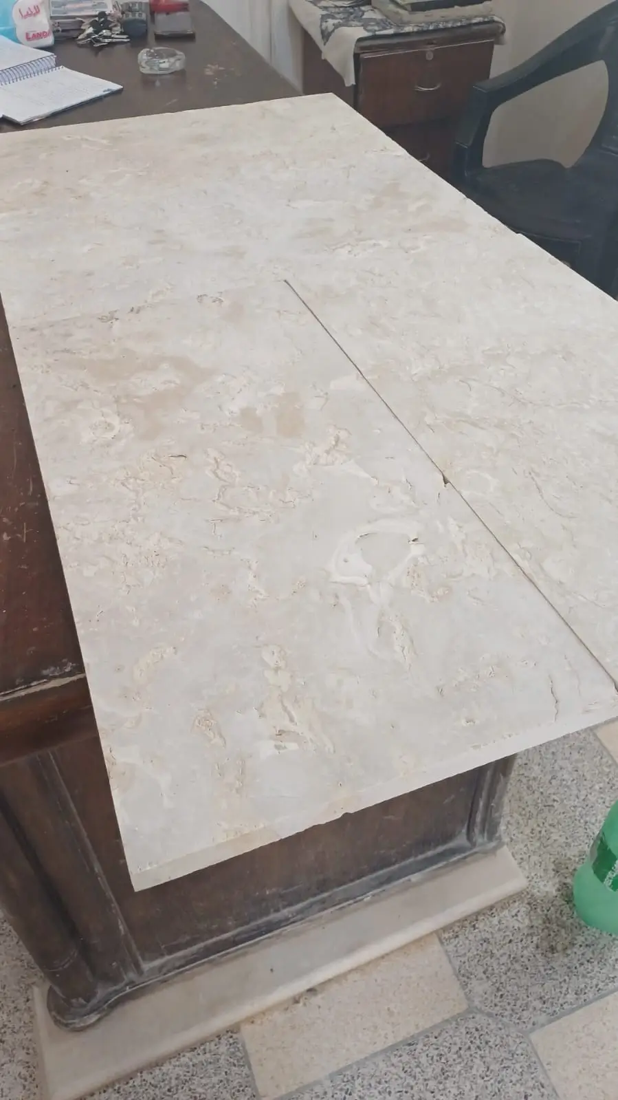
Veining is the single biggest differentiator within any white granite color guide, and understanding how each variety behaves before you finalize a specification is essential. Some stones carry soft, feathery wisps of grey and gold; others show bold, architectural veins that dominate a surface. The character of the veining determines whether a white granite surface recedes into a design or becomes a focal point.
- River white granite carries a tight, interlocking grey and burgundy vein pattern against a white-to-cream base — the movement is active but relatively contained, making it well-suited for countertop runs where you want texture without drama
- White fantasy granite delivers broader, sweeping veins in grey and occasionally warm taupe, with a translucency that reads almost luminous under directional lighting — a strong choice for feature walls or statement vanities
- Taj Mahal granite sits at the quieter end of the spectrum, with a warm ivory base and subtle gold-to-grey veining that integrates naturally with both cool and warm design palettes
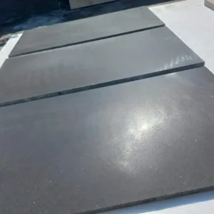
- Ice white and arctic white varieties trend toward minimal movement with a dense, almost monolithic surface that suits modern minimalist applications where pattern needs to stay secondary
The density and scale of veining also affects how forgiving a surface is in high-traffic environments. Tighter-patterned stones like river white granite tend to mask minor surface abrasion more effectively than open, dramatic varieties — a practical consideration for commercial countertop applications.
Undertone Decisions That Define Your Palette
Every slab in a white granite color guide carries an undertone — and getting that undertone wrong is the fastest way to create a space that feels subtly off without anyone being able to articulate why. The challenge is that undertones shift under different light sources, and what reads as pure white in a showroom can pull distinctly pink, green, or gold in a space with warm artificial lighting.
- Cool undertones (blue-grey, silver) read cleanest under natural daylight and LED cool-white sources — they pair best with crisp white cabinetry, stainless hardware, and cooler flooring materials like polished concrete or honed bluestone
- Warm undertones (cream, gold, ivory) work harmoniously with wood-toned cabinetry, unlacquered brass or bronze fixtures, and warmer flooring choices including honey-toned travertine or wide-plank oak
- Neutral undertones provide the most palette flexibility but can appear flat in low-contrast environments — balance them with textured secondary materials to maintain visual depth
The most reliable way to assess undertone is to hold a slab sample against the exact cabinetry finish and flooring material you’re specifying, under the lighting conditions the installed space will actually use. Daylight-only assessment leads to mismatches more often than any other single factor in white granite color guide work and light granite surface selection generally.
Pairing White Granite with Cabinetry and Hardware
Pairing decisions in a white granite color guide come down to contrast management. High-contrast pairings — bright white granite against very dark cabinetry — create graphic, contemporary results, but they expose every fingerprint, dust particle, and inconsistency in edge work. Lower-contrast pairings with mid-tone or natural wood cabinetry are more forgiving in everyday use and tend to age more gracefully across design cycles.
- Crisp white shaker cabinetry pairs most successfully with white fantasy granite when the granite carries visible grey movement — the veining provides the visual interest that flat white cabinet faces can’t deliver on their own
- Natural oak and walnut cabinetry integrate most naturally with Taj Mahal granite, where the warm ivory base echoes wood tones without competing with grain patterns
- Dark navy or forest green cabinetry creates a striking high-contrast scheme with ice white or arctic varieties — the near-monolithic stone surface keeps the composition from becoming overly busy
- Matte black hardware reads well against all white granite varieties, but polished gold and brushed brass work best against warmer stones like Taj Mahal granite where the undertone alignment creates cohesion
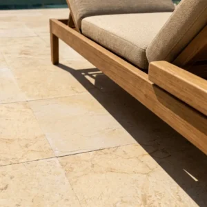
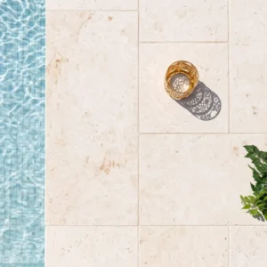
For landscape-integrated applications — outdoor kitchens, covered entertaining areas, or bar tops that transition between interior and exterior — white and light granite surface selection should also account for how the stone reads against planting, hardscape, and sky. A granite with warm ivory undertones sits more comfortably in a garden setting with Mediterranean planting or warm-coloured sandstone surround than a stark cool-white variety would.
Finish Options and Surface Performance
Finish selection in a white granite color guide affects far more than aesthetics — it determines cleaning requirements, slip resistance, heat response, and how the stone’s colour and veining actually read in an installed environment. Polished finishes amplify depth and colour saturation, making veining more dramatic and undertones more vivid. Honed finishes mute both, delivering a softer, more matte result that reads as warmer even on cool-undertone stones.
Leathered and brushed finishes occupy interesting middle ground — they retain some of the depth of a polished surface but add tactile texture and reduce glare, which makes them particularly useful in high-light environments or designs where a polished surface would create uncomfortable reflectivity. According to ASTM C615 granite dimension stone standards, the structural integrity of granite is consistent across finish types, so your finish decision is genuinely aesthetic and maintenance-driven rather than performance-driven.
- Polished: highest visual impact, easiest to wipe clean, shows fingerprints and water spots most readily — best for low-traffic decorative applications or spaces with disciplined maintenance
- Honed: matte surface, more forgiving of daily use, requires periodic sealing because the open surface is slightly more absorbent than polished — strong choice for family kitchen countertops
- Leathered: textured, mid-sheen, excellent for hiding everyday marks, particularly effective with veined stones where the texture adds dimension to the movement — growing in specification for outdoor kitchen surfaces
Sourcing and Slab Evaluation
A white granite color guide is only useful if the slabs you’re evaluating at the point of specification actually represent what you’ll receive on site. Slab-to-slab variation is a reality of natural granite, and batch consistency across a full project requires careful inventory management from the point of order. For projects spanning multiple rooms or large surface runs, sourcing all slabs from the same quarry batch is the only reliable way to control the palette.
Reviewing Citadel Stone light granite slabs at the full-slab level before committing your specification gives you the most accurate read on movement scale, undertone, and batch consistency across the run you need. At Citadel Stone, we recommend laying slabs out in their intended orientation and reviewing them under both natural and artificial light before final selection — the difference between a slab that works and one that fights your design is often visible only at full scale.
Warehouse inventory depth also matters here. Projects with tight timelines need confirmed stock availability before the design is finalised — not after the cabinetry is already on order. Citadel Stone maintains warehouse stock of key white and light granite varieties, which means you’re not waiting on extended import lead times when your project schedule is running.
Landscape and Exterior Design Integration
Design integration extends well beyond the kitchen or bathroom in a thorough white granite color guide. Exterior applications — outdoor kitchen counters, bar tops, garden feature elements — call for the same undertone and pairing discipline as interior work, with the added layer of how the stone reads against architectural materials, planting, and natural light at varying times of day.
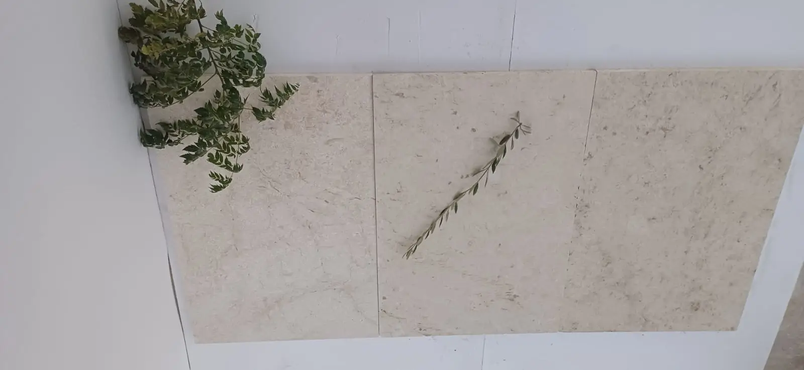
Cool-white granites with blue-grey undertones integrate naturally with modern minimalist landscapes where the palette is restrained — concrete, steel, clipped hedging, and grey gravel create a coherent context for a stone that reads clean and architectural. Warmer ivory stones like Taj Mahal granite work better in softer landscape frameworks: mixed perennial planting, timber pergola structures, natural stone paving, or gardens with a traditional or Mediterranean character where warmth and organic texture dominate. The material’s natural durability makes it credible for exterior use in demanding conditions — granite’s low absorption rate and compressive strength above 19,000 PSI give it genuine weather resistance, as documented in USGS dimension stone production and use data. Understanding how white and light granite surface selection interacts with the broader landscape palette is what separates a specification that photographs well from one that lives well.
Common Specification Mistakes
Field experience with white granite projects reveals a consistent set of errors that drive the majority of post-installation dissatisfaction. Most of them are avoidable with earlier decision-making in the specification process.
- Selecting from small cut samples rather than full slabs — the pattern scale on a 4-inch sample bears no reliable relationship to how a full countertop run will actually read
- Ignoring undertone under installed lighting conditions — the specification needs to be evaluated under the light source the space will actually use, not showroom daylight
- Mixing slab batches across a project without verifying visual consistency — even within the same variety name, quarry batches can vary enough to create a mismatched installed result
- Specifying a polished finish in high-traffic family kitchens without a realistic maintenance conversation — honed or leathered finishes reduce daily maintenance burden significantly
- Over-specifying dramatic veining in small spaces where the scale of movement overwhelms the room rather than enhancing it
White Granite Color Guide: Moving Forward
The decisions that matter most come down to three things: understanding your stone’s undertone, matching it precisely to your design palette under real lighting conditions, and verifying slab-level consistency before committing your specification. Veining character — whether you’re working with river white granite’s contained movement, white fantasy granite’s sweeping drama, or Taj Mahal granite’s quiet warmth — is a design decision as much as a material one, and it should be made with full slabs in front of you, not thumbnail images. Your project’s pairing success depends on that rigour more than on any single product choice. For projects that also incorporate decomposed granite in landscape or pathway applications, stabilized vs loose decomposed granite options explores how different material forms perform in outdoor hardscape contexts. Grey granite and warm-white varieties pair differently with cabinetry finishes, and Citadel Stone’s slab range lets designers compare movement and undertone before specifying.
Related reading: granite wholesale slabs · granite edges · granite stain.