
Willemstad’s waterfront is the Caribbean’s most recognizable image: the Handelskade’s painted gables reflected in St. Anna Bay, a Dutch streetscape transposed to the tropics and glowing in colors Amsterdam never dared. Behind the postcard runs a working UNESCO city — Punda’s commerce, Otrobanda’s revival, Pietermaai’s boutique renaissance — and every project inside it inherits the same brief: add to a masterpiece without smudging it. Stone choices carry much of that responsibility, and this is their guide.
Reading the painted palette
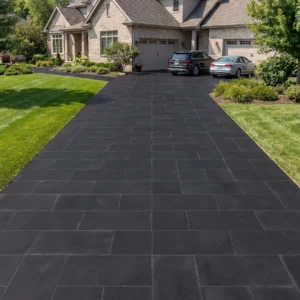
The city’s color is its signature, and new stonework must converse with it rather than compete: floors and courtyards in warm neutrals — creams, buffs, soft grays — that let ochre, terracotta and cobalt facades keep the melody; low-sheen finishes that respect the tropical light bouncing between painted walls; and black basalt used the way the city uses its ironwork, as graphic punctuation rather than field. The test is photographic: shoot the project’s own street, pin samples against the photographs, and choose stone that makes the paint look better — because in Willemstad, the paint is the client.
Courtyards: the city’s hidden rooms
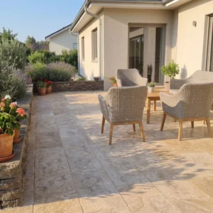
Behind the gabled frontages hide the quarter’s best spaces — courtyards that once served merchants and now serve boutique hotels, restaurants and the city’s finest apartments. Renovating them runs the cluster’s heritage rules at Dutch-colonial pitch: margins and movement joints where new paving meets old masonry that breathes, ground levels held honest against historic walls, drainage threaded through fabric that predates every code, and patina welcomed as the finish line. The harbor-town craft translates directly; Willemstad simply paints it brighter.
- Keep the courtyard floor calm, since the surrounding walls already carry all the color needed.
- Match new paving tone to the render rather than to the shutters or the trim.
- Use a format that suits the room, because a merchant courtyard is smaller than it photographs.
- Leave original thresholds and steps in place wherever they are structurally sound.
Pietermaai’s hospitality lesson
Pietermaai’s revival — ruined mansions reborn as boutique hotels and cafés — wrote the modern playbook for commercial heritage work: guest-grade surfaces inside monument envelopes, courtyard dining on stone that handles hospitality’s duty cycle, and the photographed-frames logic running at UNESCO intensity, because every guest arrival is a heritage photoshoot. The specification balances deference with durability: warm-toned dense stone, eased edges for chair-scrape, hose-down serviceability — the painted city’s beauty, engineered for breakfast service.
Streets, thresholds and the public interface
Quarter projects meet the public realm at their thresholds, and the interface deserves civic care: entrance steps meeting worn street levels graciously, thresholds that welcome every knee and wheel per the accessibility discipline, and private paving that defers to the street’s own historic surfaces where they survive. Monument authorities read these junctions closely — documentation, drawn details and tonal respect move approvals — and neighbors read them daily, which in a city this proud matters just as much.
The landhuis dimension
Beyond the city walls, the same conversation continues at estate scale: the island’s landhuizen — plantation great houses on their windswept rises — anchor restorations where terraces, courts and garden walls extend historic fabric into livable luxury. The rules hold: warm tones beside weathered render, honest textures, junctions drawn, new work confident in its own era rather than costumed. A landhuis terrace done well delivers the island’s deepest architectural experience — centuries of Dutch-Caribbean life, walkable at sunset — and stone is the material that joins the timeline without falsifying it.
- Take the palette from the building rather than importing a contemporary neutral.
- Keep new work legible as new, so the historic fabric is never in doubt.
- Use lime-compatible mortars and jointing where new stone meets original masonry.
- Document what was replaced, because the next custodian will need to know.
Working in a masterpiece
The practical file completes the guide: monument-sensitive approvals engaged early with documentation prepared to their standard, the narrow-street delivery craft planned before sailing, works phased around the quarter’s commerce and festivals, and crews briefed that the site’s neighbors include a World Heritage listing. None of it constrains good design; it selects for it. The Curaçao supply guide prepares heritage packages as a specialty — samples first, always viewed against the paint they will serve.
Paint and patina: two aging curves, one streetscape
Willemstad’s beauty runs on two materials aging at different speeds: paint, which fades brilliantly and renews on cycles, and stone, which mellows continuously and renews never. Managing the pair is the quarter’s particular craft. The painted facades run their maintenance calendars — tropical sun and salt air see to that — and each repaint subtly retunes a street’s color chord; ground-level stonework, chosen warm and neutral precisely so the paint can lead, absorbs those retunings gracefully — the buff court that flattered the previous ochre flatters its successor — which is the deepest argument for the restraint this guide preaches: neutral stone is color-cycle insurance. Owners coordinating their own repaint-and-renovate schedules do best sequencing paint first, stone care second: facade work drips and splashes, and the terrace clean that follows the painters leaves both surfaces opening together.
The patina half of the partnership asks its own respect: quarter stonework that has weathered decades carries the soft surface history no new material replicates, and interventions follow conservation instinct — clean gently and rarely, repair by the unit from matched stock, re-tool worn treads only where safety genuinely demands, and let thresholds keep the wear that records a century of feet. New stone joining old runs the honest-junction rules rather than distressed mimicry. The streetscape’s lesson generalizes across the island’s landhuis estates and beyond: build the palette so paint can dance and stone can age, maintain each on its own calendar, and the composition improves annually — which, four centuries into the experiment, Willemstad has rather conclusively proved.
What the World Heritage listing actually protects
Willemstad is not merely picturesque, it is inscribed. The World Heritage listing for the Historic Area of Willemstad covers 86 hectares with an 87 hectare buffer zone across four districts: Punda, built in the seventeenth century on the eastern side of Sint Anna Bay, and Otrobanda, Pietermaai and Scharloo, all dating from the eighteenth. Roughly ninety percent of the buildings are privately owned, and protection runs through an interlocking system of zoning plans and monument ordinances administered by the Monuments Office.
- Assume the listing applies to the setting, not only to the individual facade you are working on.
- Expect a monument ordinance process rather than an ordinary permit for protected fabric.
- Read the buffer zone as a real constraint, since it is nearly as large as the inscribed area itself.
- Coordinate with neighbors, because private ownership across ninety percent of the stock makes the street a collective work.
- Keep interventions reversible where the historic material is the asset.
Why the city is painted at all
The famous palette has a documented origin. The same listing records that in 1817 the previous style of white lime finish on building exteriors was prohibited, apparently to protect eyesight from the glare, and the dominant colors that followed were red, blue, yellow ochre and various shades of green. That is a lesson for anyone specifying a ground plane here: the walls are already doing the work, and a brilliant white surface is the one thing the city explicitly rejected two centuries ago.
- Avoid brilliant white paving, which reproduces the exact glare problem the 1817 rule was written to solve.
- Choose a mid-tone ground plane so the painted elevations remain the event.
- Pick up the ochres and warm neutrals of the render rather than fighting them with a cool gray.
- Use texture rather than color for interest, since color is already fully committed above eye level.
Choosing stone that suits a two hundred year old wall
Historic masonry is porous, lime-bound and moves. The reference from the Natural Stone Institute on limestone sets out what matters: absorption running from below one percent to above ten across the family, dolomitic varieties denser with lower absorption and higher abrasion resistance, and universal vulnerability to acid. Beside original lime mortar, acid sensitivity stops being a footnote and becomes the governing constraint.
- Keep every acidic cleaner off the site specification, because one wash can damage stone and mortar together.
- Choose lower absorption at ground level where salts rise through old walls.
- Prefer dolomitic material in courtyards that take daily traffic.
- Allow the new floor to breathe rather than sealing moisture into a wall that has always managed it.
Willemstad heritage stone that respects the listing
Working inside an inscribed city is a privilege with obligations attached. Quiet mid-tone paving that lets the painted walls speak, lime-compatible detailing, no acids anywhere near original mortar, and reversible interventions that the next custodian can read and undo. Our Curacao stone supply guide sets out the formats, finishes and lead times that suit this island. The city already chose its colors in 1817, and the job of a ground plane here is to make that choice look effortless.