
Why Material Choice Defines the Pattern
Checkerboard floor tile rewards material precision more than almost any other layout — the alternating contrast between two tones lives or dies on how consistently each piece holds its colour, finish, and dimension across the full field. You’ll notice this immediately when you compare polished marble against honed travertine in a two-tone grid: marble delivers sharper tonal contrast while travertine softens the visual rhythm, creating a warmer, more relaxed version of the same classic pattern. The material decision shapes the entire personality of the space before a single tile is set.
Natural stone brings a depth to checkerboard layouts that manufactured alternatives genuinely struggle to replicate. Each tile carries subtle veining, tonal shifts within the colour band, and surface texture variation that gives the pattern visual movement rather than flat repetition. According to NSI stone tile specifications, dimensional consistency across batches is a key performance criterion — and that consistency is exactly what separates a crisp, professional checkerboard floor tile grid from one that reads as uneven at the grout line.
Classic Black and White Marble Combinations
The black-and-white checkerboard floor tile is the reference point that everything else gets measured against. Nero Marquina or Absolute Black paired with Thassos White or Carrara creates maximum contrast — the kind that reads clearly from any distance and anchors formal interiors like entrance halls, butler’s pantries, and powder rooms with genuine authority.
Finish selection matters as much as the colour pairing here. Polished finishes amplify contrast and make the pattern feel more theatrical and formal. Honed finishes pull the same two stones toward a quieter, more antique sensibility — closer to historic European stone floors than to contemporary showroom drama. For spaces where people stand and move frequently, honed surfaces offer better traction underfoot, which is a practical consideration that often settles the debate for kitchen applications.
- Polished black marble against polished white: maximum contrast, formal residential and commercial applications
- Honed black against honed white: softened contrast, period-appropriate for traditional interiors
- Brushed black with honed white: subtle finish variation within a neutral palette
- Mixed gloss levels (one polished, one honed): adds dimension but requires careful lighting assessment before committing
Travertine Two-Tone Layouts
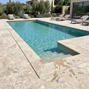
Travertine opens up a different register for the checkerboard format — one that replaces stark contrast with tonal warmth. A classic combination pairs ivory travertine against walnut or noce travertine, using the natural colour banding within each stone rather than forcing an artificial black-and-white polarity. The result reads as distinctly Mediterranean and works well in kitchens, living spaces, and covered outdoor areas where pattern without severity is the goal.
The key technical consideration with travertine checkerboard floor tile is fill consistency. Travertine’s characteristic open-pore structure means unfilled travertine in a high-traffic checkerboard grid will show differential wear at the voids over time, particularly at corners where two tiles meet at a single grout intersection. Specifying filled-and-honed travertine for both tones in the grid keeps maintenance predictable and protects grout joint integrity across years of use. For a broader look at complementary tile formats, Citadel Stone two-tone tile range covers additional pairing and sizing options worth reviewing before locking in a specification.
- Ivory and noce travertine: warm, tonal contrast suited to Mediterranean and transitional interiors
- Silver and ivory travertine: cooler pairing that reads more contemporary
- Filled-and-honed finish: essential for high-traffic checkerboard applications
- Unfilled travertine: suitable only for decorative or very low-traffic feature areas
Sizing the Grid for Your Space
Tile size relative to room dimension is one of the most consequential decisions in a checkerboard layout. A 12×12 grid reads busy in a large entry hall and appropriately bold in a powder room. A 24×24 grid creates a more stately, less frenetic pattern in rooms above roughly 200 square feet — the checkerboard rhythm slows down, and the individual stone qualities become more visible in each tile.
The perceived size of the pattern shifts with grout joint width as much as tile dimension — and this is what most specifiers underestimate. A 3mm joint in a 24×24 checkerboard floor tile layout nearly disappears, letting the two-tone contrast dominate. A 6mm joint in the same layout introduces a visible grid structure that competes with the alternating colour pattern. For clean, classic checkerboard work, keep joints at 2–3mm and prioritise rectified tile stock — the dimensional tolerances on unrectified natural stone at large format make tight joint work genuinely difficult in the field.
- 12×12: best for compact spaces, bathrooms, and feature floor areas
- 18×18: versatile size that transitions well between residential scales
- 24×24: suited to large rooms, commercial entries, and formal living areas
- Grout joint 2–3mm: maintains clean pattern definition without crowding the stone
- Rectified stock: essential for consistent joint spacing across large fields
Diagonal Versus Straight-Lay Patterns
The same checkerboard floor tile set on a 45-degree diagonal reads as a completely different design choice from the same tile laid square to the wall. Diagonal installation — sometimes called diamond pattern — elongates rooms visually, draws the eye toward the room’s longest axis, and references classical European stone flooring traditions more directly than straight lay does.
Straight-lay checkerboard works better when the goal is to reinforce the room’s geometry — aligning tile joints parallel to walls creates a grounded, ordered quality that suits formal dining rooms and libraries particularly well. Diagonal lay works better for hallways and narrow rectangular rooms where apparent width is desirable. The trade-off is waste factor: diagonal installation typically generates 10–15% more offcut waste than straight lay on the same room footprint, which affects both material cost and the quantity needed to order.
Colour Pairings Beyond Black and White
The checkerboard format doesn’t require maximum contrast to succeed — some of the most sophisticated versions of this pattern work in near-tonal pairings where the two stones share a colour family but differ in tone, finish, or veining density. Consider warm grey limestone against cool cream limestone: the contrast is subtle enough that the pattern reveals itself gradually as lighting conditions change across the day, giving the floor a quality of depth that high-contrast versions don’t offer.
Terracotta and cream combinations in unglazed tile bring a distinctly rustic, Provençal quality to the checkerboard format. Sage green and buff limestone work well in conservatories and garden rooms where the floor should reference the outdoors without competing with planted elements. The principle that guides all of these: the two stones need to be tonally distinguishable at three metres distance — if the contrast collapses at viewing distance, the pattern simply disappears into an undifferentiated field. According to ASTM natural stone tile testing standards, colour consistency within a stone batch is a measurable specification criterion, which means batch uniformity documentation can be requested before committing to large quantities.
- Warm grey and cream limestone: sophisticated, tonal contrast suited to transitional interiors
- Terracotta and buff: rustic character for farmhouse and Mediterranean-inspired spaces
- Sage and ivory: works in conservatories, garden rooms, and informal living areas
- Navy blue and white marble: bold contemporary interpretation of the classic format
Budgeting and Sourcing Considerations
A two-material checkerboard floor tile project introduces a budget variable that single-material installations don’t have: two separate stone types are in play, often from different quarry sources, with freight logistics to manage for both. That complexity adds up quickly, particularly when the two stones come from different regions or require different fabrication processes. At Citadel Stone, we’ve found that sourcing both tones from a single supplier with matched warehouse inventory dramatically simplifies logistics and keeps lead times consistent — there’s no waiting on one stone while the other sits on-site.
Freight distance from warehouse to project site affects the total cost of a checkerboard floor tile specification more than most buyers account for in the initial budget. Stone is dense, and even modest tile quantities generate significant shipping weight. Projects in areas with well-developed stone distribution infrastructure typically see material-to-labor cost ratios around 40:60 for natural stone checkerboard work. Where freight adds substantially to delivered cost, that ratio can shift toward 35:65, meaning the labor cost percentage rises as a share of total spend even if the material cost itself stays flat.
- Source both tile tones from the same supplier to align delivery schedules and reduce logistics risk
- Factor freight weight into budget early — checkerboard projects require double the material SKUs of single-stone installations
- Check warehouse stock levels for both tones before committing to project timelines
- Where freight costs are a significant factor, value-engineering toward more widely available stone tones reduces delivered cost without sacrificing pattern quality
- Request matched batch documentation for both stones — colour drift between production batches disrupts checkerboard contrast
Citadel Stone maintains national warehouse inventory across its natural stone tile range, which typically compresses lead times compared to direct-import sourcing cycles. For checkerboard projects on tight schedules, that stock availability can be the deciding factor between hitting an installation window and pushing the project.
Installation Details That Protect the Pattern
The technical detail that most directly determines how a checkerboard floor tile installation reads over time is subfloor flatness. A checkerboard grid amplifies any high or low point in the substrate because the alternating tile joints run continuously across the full field — a single tile that’s 1.5mm proud of its neighbour creates a noticeable edge that the eye tracks along the contrast line. L/360 deflection tolerance is the minimum substrate specification for natural stone checkerboard work; tighter is better, particularly at large format sizes.
Setting material selection for two-stone checkerboard work needs to account for differential movement between the two tile types. Marble and travertine have different thermal expansion coefficients, and in rooms with underfloor heating, that differential becomes a real specification concern. Using a flexible medium-bed mortar rated for dimensional stone, combined with movement joints at perimeter walls and at any change in substrate material, gives the installation the accommodation it needs to move without cracking at the grout line. The TCNA installation standards for natural stone tile provide specific guidance on setting bed depth, movement joint spacing, and mortar type selection for stone tile over heated substrates.
- Subfloor flatness: maximum 3mm variation in 3 metres for 12×12 tile; tighter tolerances required at 24×24
- Flexible medium-bed mortar: required for stone over underfloor heating and at large format sizes
- Movement joints: perimeter, at structural breaks, and every 4–5 metres through the field
- Grout selection: epoxy grout for high-traffic and moisture-prone areas; unsanded cement grout for 2–3mm joints
- Sealing: both stone tones sealed before grouting to prevent grout hazing in the pore structure
Final Considerations for Checkerboard Floor Tile
Getting a checkerboard floor tile installation right depends on decisions made well before the first tile is set — material pairing, finish consistency, tile size relative to room scale, substrate preparation, and sourcing logistics all compound in a pattern this visually precise. The installations that look effortless ten years after completion are the ones where each of those decisions was made deliberately, not defaulted. The pattern is unforgiving of shortcuts in a way that field-running or herringbone layouts simply aren’t, because any dimensional inconsistency, grout variation, or colour drift reads directly along the contrast line between the two stones.
As planning moves to adjacent spaces and transitions, related tile formats can inform how connecting areas are handled. hexagon tile design and layout options explores another classic geometric format that pairs well with checkerboard fields in connecting corridors or entry vestibules. Marble and travertine from Citadel Stone arrive in matched 24×24 tile sizes, keeping checkerboard grids square across large rooms.
Related reading: large tile lippage problems · bathroom floor tile ideas · porcelain floor tile.