
Contrast That Actually Works in Stone
Black and white pavers create a visual tension that very few other material combinations can replicate — but the designs that hold up over time share a common specification logic that goes well beyond color selection. You’re working with contrast ratios, surface finishes, and joint geometry simultaneously, and each decision amplifies or undermines the others. Nail the interplay, and the result reads as intentional and architectural. Miss it, and the pattern looks busy rather than bold.
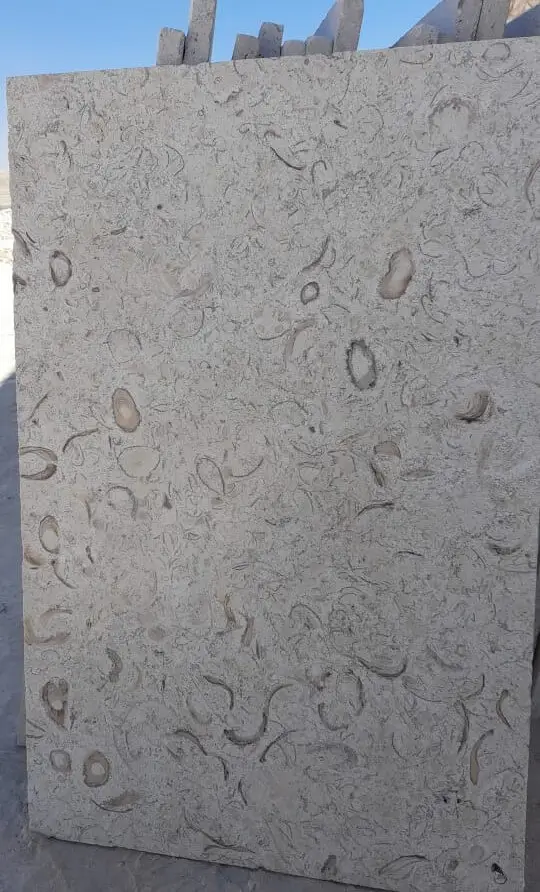
Bold Design Ideas for Black and White Paver Layouts
The strongest black and white paver designs treat each color as a structural element, not decoration. Here are the layout approaches that consistently deliver high-impact results:
- Checkerboard grids in equal-format squares — the most legible pattern at a distance, works best when both colors share the same finish (honed on both, brushed on both)
- Diagonal chevrons with contrasting borders — rotating a standard grid 45 degrees dramatically changes how the space reads, and a single-course border in the opposing color defines the perimeter without overcomplicating the field
- Radial medallions with black paver inserts — central feature panels where dark stone radiates outward from a focal point, surrounded by a white limestone field
- Random-coursed flagstone with dark mortar joints — when using irregular-format stone, the joint color does much of the contrast work; black grouting against white limestone reads as a distinct design choice
- Banding and inlay strips — inserting parallel bands of darker stone every four to six courses breaks up large field areas and creates visual rhythm without overwhelming the space
Your layout choice has real consequences for how the installation reads under different light conditions. High-noon sun flattens contrast; low-angle morning or evening light makes geometric patterns pop dramatically. Factor that into your orientation decisions, especially for east- or west-facing terraces.
Adding Pattern Depth with Hexagon Pavers
Hexagon pavers introduce a third geometric language into black and white paver schemes that neither squares nor rectangles can achieve. The honeycomb geometry creates a more organic rhythm than rectilinear grids, which makes hexagon pavers particularly effective in garden and courtyard settings where hard-edged formality would feel out of place.
The specification challenge with hexagons is the cut edge. You’ll encounter significantly more angled cuts at borders and transitions than with square or rectangular formats, and each cut exposes raw stone face that needs sealing to match the finished surface behavior. Budget for additional cutting time and sealant application along all perimeter runs. For black and white paver schemes using hexagons, alternating colors in a 60:40 ratio (dominant white, accent black) tends to read more cleanly than a true 50:50 split, which can feel optically restless.
Using White Pavers with Black Pebbles for Texture
White pavers with black pebbles are a particularly effective combination when you need to break up large paved areas without introducing additional cut stone. The pebble infill reads as a deliberate texture layer rather than a gap-filler, and it handles irregular shapes and organic borders far better than any cut-stone inlay could.
Technically, the detail requires attention to depth. Your pebble bed needs to sit flush with the finished surface of the adjacent pavers — typically 20–25mm below the paver’s top face if you’re using a mortar-set pebble mosaic, or at compacted sub-base level for dry-laid river pebble fills. Mis-match that depth by more than 5mm in either direction and you create a trip hazard at the transition edge. The NSI limestone variety specifications provide useful guidance on surface compatibility when pairing different stone types in the same installation plane.
Sunken Pavers and Level Changes in Two-Tone Schemes
Sunken pavers — individual units or small clusters set deliberately below the surrounding field level — are a sophisticated detail that adds tactile interest and channels water away from high-traffic zones simultaneously. In a black and white scheme, you can use color to reinforce the level change: dark units at the lower plane read as shadow and depth, white units at the higher elevation catch light and define the overall field geometry.
The structural detail matters here. Sunken pavers in a drainage context need a minimum 6mm depression below the finished surface of surrounding units, with a clear path for water to exit the lower zone. You’ll need to account for that depth offset in your bedding layer — which means your base preparation under sunken sections must be correspondingly shallower to maintain the structural competence of the compacted sub-base. Don’t compensate for the level change by reducing the bedding layer depth; adjust the sub-base excavation instead.
For projects where two-tone material coordination matters from the outset, our two-tone paver selection covers the pairing options and format combinations we stock ready to ship.
Subgrade Conditions and What They Mean for Your Layout
Here’s what most specifiers get caught on with black and white paver installations — the subgrade conditions that affect long-term levelness matter far more to the visual outcome than the material selection itself. A perfectly specified two-tone geometric pattern degrades fast when differential settlement starts working unevenness into the field. With a single-color installation, minor movement is forgivable. With a high-contrast geometric pattern, any deviation from flush reads immediately.
Expansive clay soils present the most common challenge. Clay-heavy subgrades expand and contract with moisture cycling, and that movement is rarely uniform across a paved area. You’ll typically see more movement near drainage edges and less in the central field — which means the border courses of your geometric pattern are the first to show distortion. The mitigation is a deeper compacted aggregate base (minimum 150mm in moderate-expansion clay, 200mm or more in high-plasticity soils) and a geotextile separation layer between native soil and aggregate to prevent clay migration upward into the base.
- Sandy or rocky soils: generally stable but require careful compaction verification — loose sand allows point settlement under heavy loads
- Expansive clay: requires deepened aggregate base and perimeter drainage to manage moisture content
- Caliche layers: hard caliche breaks unpredictably and can create voids when it fractures — probe for depth before specifying base thickness
- Fill soils: any imported fill needs at least 12 months of settlement before paving, or engineered compaction to 95% Proctor density minimum
The usgs.gov/myb/vol1/2018/myb1-2018-dimension-stone.pdf”>USGS dimension stone production and use data documents the range of stone types used in paving applications nationally, which gives useful context when specifying stone weight and loading on varied subgrade types.
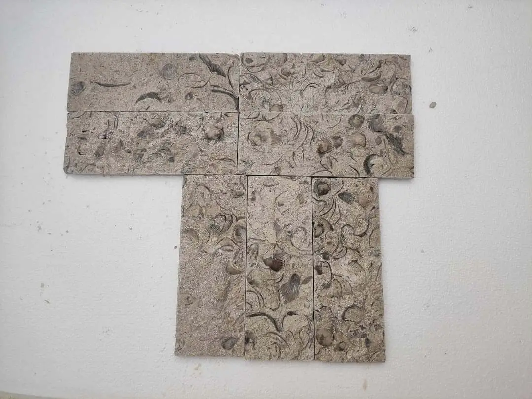
Finish Selection and How It Affects Contrast
The finish you specify on black and white pavers changes the perceived contrast ratio more than the actual color difference between stones. Polished surfaces amplify contrast dramatically — white limestone becomes near-reflective, dark basalt or black granite deepens toward matte-black. That combination is striking indoors but creates glare problems in full sun on outdoor installations.
For outdoor applications, honed or brushed finishes on both elements reduce the reflectivity differential and produce a more even contrast that holds up across all lighting conditions. If you’re specifying a mix of polished and matte finishes intentionally — dark polished inserts in a honed white field, for example — confirm that the slip resistance ratings meet the application requirements. ANSI A326.3 testing protocols define the minimum wet dynamic coefficient of friction for outdoor pedestrian surfaces, and polished dark stone in wet conditions can fall below that threshold.
- Honed on both colors: most versatile, even contrast, outdoor-safe slip resistance
- Brushed or tumbled: softened contrast, excellent for garden and informal settings
- Polished: maximum visual impact, better suited to covered or interior use
- Flamed finish on dark stone: increases texture and slip resistance while retaining color depth
At Citadel Stone, we carry honed limestone and basalt in complementary formats specifically because most two-tone projects specify both finishes from a single order — coordinating that through warehouse stock rather than separate sourcing cycles keeps your lead times predictable.
Getting Scale and Format Matching Right
The format size you select for black and white pavers needs to be proportionate to the space it’s serving. Oversized units in small courtyards make the pattern feel compressed — the eye can’t read a full repeat of the design before reaching the border. Undersized units in large driveways or terraces create a pattern that reads as texture rather than geometry when viewed from a standing distance.
A useful rule of thumb: your paver format repeat (the full width of one pattern cycle in your chosen layout) should fit at least three times across the narrowest dimension of your paved area. So in a 3-meter-wide path, your pattern repeat shouldn’t exceed 1 meter — which typically means individual unit sizes of 400–600mm work well. In a 10-meter terrace, you have the room to work with 600–800mm units in a large-format checkerboard.
Dimensional consistency across a stone batch is one of the most critical quality factors for geometric paving — even minor thickness variation within a delivery can create lippage that breaks the clean joint lines a two-tone design depends on. Citadel Stone’s warehouse quality checks flag thickness tolerance issues before material ships, which saves you from discovering the problem mid-installation.
Final Considerations
Getting black and white pavers right means making decisions that compound across the whole installation — layout geometry, subgrade preparation, format selection, and finish specification all interact with each other. A design that looks perfect on plan can read as cluttered on site if the pattern scale doesn’t match the space, or as distorted within a few seasons if the subgrade wasn’t prepared for the soil conditions present. Your strongest results come from resolving those variables before the first unit is set, not adjusting on the fly. As you plan your broader hardscape project, related natural stone applications can inform your material decisions — limestone driveway design ideas explores how similar specification logic applies in a different but complementary context. Product from Citadel Stone lets you combine black and white pavers into geometric layouts that stay flush across the surface.
Related reading: Black Rocks for Driveways: Heat, Fading, and Weeds · Driveway Limestone: A Complete Buyer’s Guide · Crushed Limestone for Driveway: Full Guide.