
Reading Color in Travertine Pavers
The travertine paver colors guide most specifiers reach for first organizes tone by quarry origin, but the variable that actually drives color in the finished paver is cut direction. A cross-cut slab exposes the banded, cloud-like layers of the stone’s depositional history, amplifying warm ambers and creams. A vein-cut slab runs parallel to those layers and tends to read cooler — flatter ivory tones with more linear movement. Before you lock in a palette, request samples of both cut orientations in your shortlisted color, because the difference can shift the entire character of a project.
Finish compounds the effect. A honed surface opens the stone’s micro-texture and pulls warmer undertones forward. A brushed finish on the same block can read a half-tone cooler and more muted. You’re not just choosing a color name — you’re choosing color as it will read under your project’s specific light exposure and finish specification.
Ivory and Cream Tones: The Benchmark Palette
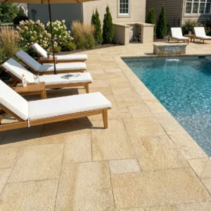
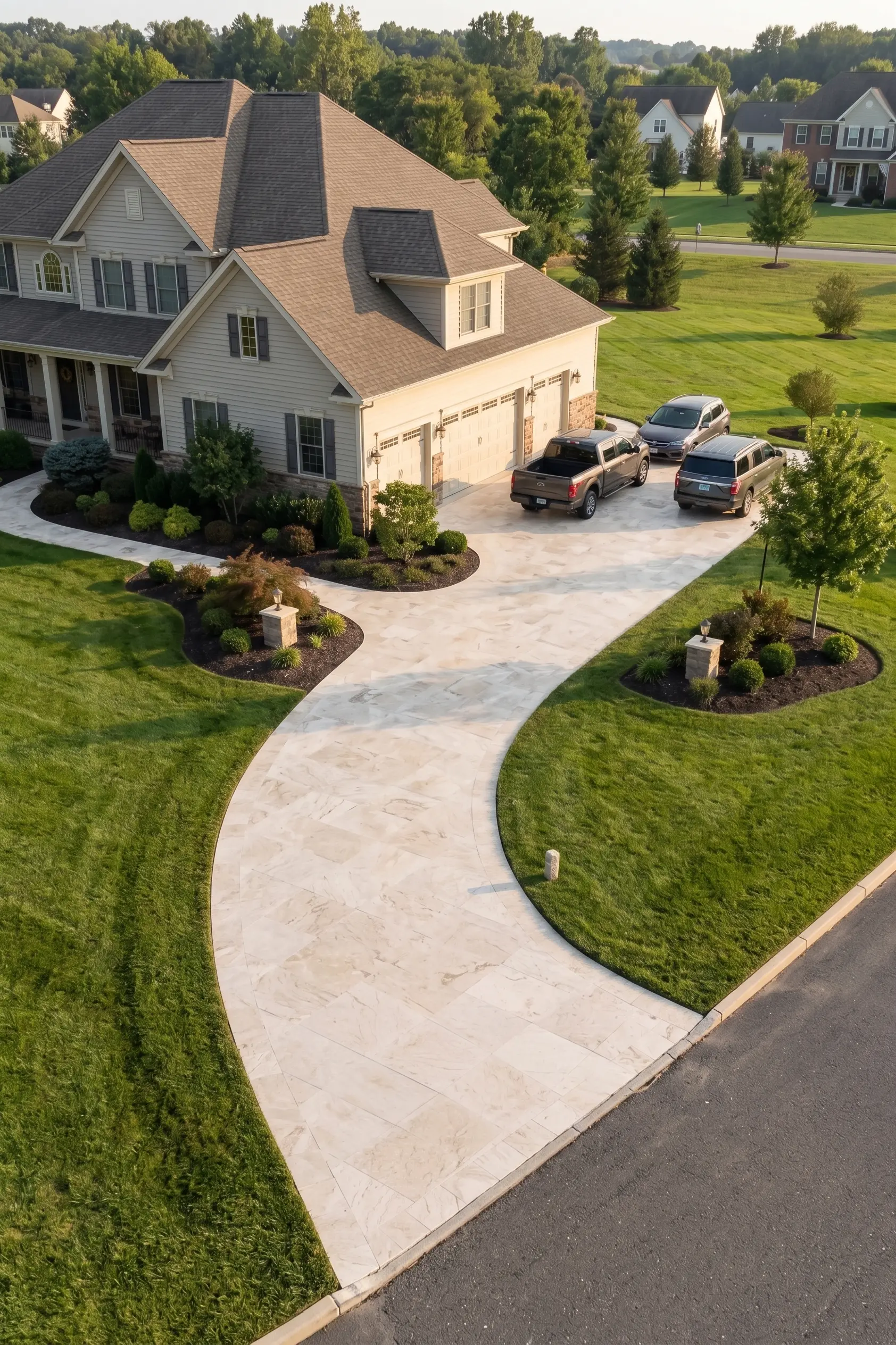
Ivory travertine is the color most people picture when they think of the material, and for good reason — it’s the tone that made travertine synonymous with warm Mediterranean architecture. The color sits in a narrow band between pale cream and soft gold, with veining that can run from whisper-light to pronounced amber. In full sun, ivory pavers reflect strongly and stay significantly cooler underfoot than darker igneous alternatives, which matters considerably on pool decks and barefoot-traffic patios.
Cream variants lean slightly cooler than ivory — less gold, more white — and they pair more easily with contemporary grey cladding or white render. Your design’s undertone commitment is the critical decision here. An ivory paver in a space with warm timber accents reads unified; that same ivory against cool bluestone pool coping can look discordant. According to Natural Stone Institute travertine properties and outdoor suitability, the calcium carbonate mineralogy that drives travertine’s characteristic creamy palette also governs its thermal and absorption behaviour — both directly relevant to color stability over a long service life.
- Ivory tones suit Mediterranean, Spanish Colonial, and Tuscan-influenced design languages
- Cream tones integrate cleanly into contemporary and transitional palettes
- Both benefit from a color-enhancing impregnating sealer that deepens the warmth without creating a surface film
- Veining intensity varies significantly between quarry runs — ordering from a single batch avoids patchwork effects across large areas
Walnut and Noce Tones: Depth Without Darkness
Walnut travertine — sometimes labelled Noce — sits in the warm mid-range between cream and dark brown. The color derives from elevated iron oxide content within the calcite matrix, and it’s one of the least predictable tones in the travertine family. Two pallets from the same quarry can vary meaningfully, with one leaning toward a rich café-brown and another closer to a toffee-amber. That variation is the material’s nature, not a quality defect, but your specification notes should flag acceptable tone range to avoid disputes on delivery.
Walnut pavers work well where ivory would read too bright or too formal. Shaded patios, under-pergola terraces, and naturalistic garden paths all benefit from walnut’s earthier register. The darker ground also conceals organic soiling better than ivory in high-canopy settings — a practical advantage that rarely makes it into specification documents but matters considerably over the first decade of service. You’ll find our ivory and walnut travertine pavers cut to order from our selected quarries, with samples available before you commit to full project quantities.
Silver and Gray Travertine Pavers: The Contemporary Shift
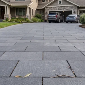
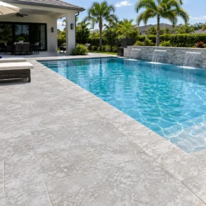
Gray travertine pavers represent the most significant design shift in the travertine market over the past decade. Where ivory dominated pool and patio specifications for generations, gray travertine pavers now anchor a wide range of contemporary, minimalist, and coastal-modern projects. The color sits in a distinctly cooler register — blue-grey to silver-grey — and it pairs naturally with concrete, steel, and light-toned timber without the warmth conflict that ivory can create against those materials.
Grey travertine pavers vary in tone more than the name implies. Silver travertine reads almost white in direct sunlight and closer to pale steel in shade. A deeper charcoal-grey variant exists at the other end of the spectrum. Your specification should describe the tone range you’ll accept, tied to an approved sample, rather than relying on a color name alone — quarry runs shift, and “grey travertine pavers” covers a broad family. The ASTM C1527 standard establishes dimension stone specifications for travertine; request the test report from your supplier to confirm that the material grade you’re receiving meets the relevant property thresholds for your application, per ASTM C1527 travertine dimension stone standard specifications.
- Silver-grey tones suit pool surrounds, contemporary outdoor kitchens, and rooftop terraces
- Cooler tones show efflorescence more visibly — ensure drainage is engineered before specifying
- Honed grey travertine reads more industrial; a brushed finish on the same material softens the palette considerably
- Grey travertine pavers in unfilled format retain the void texture that interrupts the cool tone with natural shadow — worth considering before specifying filled and honed
How Grade Affects Color Consistency
Color and grade are related but not the same thing. Grade in travertine refers to fill consistency, hole frequency, and edge integrity — not to tone. But a premium-grade paver is typically sorted from a more consistent quarry run, which means tighter color banding. A standard or commercial-grade paver may carry the same nominal color name but with wider tone swing across the batch.
The practical implication: a large open patio using standard-grade ivory travertine paver color options will show more natural variation than the same area in premium grade. That variation is not automatically a problem — a naturalistic landscape design often benefits from it. But a formal courtyard or a tight geometric pattern does not. Clarify grade expectation at specification stage, not at delivery. At Citadel Stone, we review material against the agreed specification and approved sample before orders are confirmed, which is the practical step most procurement processes skip.
Finish Choices and Their Effect on Color Reading
Your finish selection changes how the eye reads travertine color in the field more than most specifiers anticipate. Tumbled travertine — where the edges and faces are rounded and abraded — intensifies the rustic warmth of ivory and walnut tones. The open, matte texture breaks light evenly and reduces the contrast between the stone’s filled voids and surrounding matrix, producing a softer, more unified color read. Brushed and honed finishes on the same material read distinctly differently — brushed leaves a directional texture that catches raking light and creates subtle tonal variation across the field, while honed produces the most consistent color surface of all common finishes.
Understanding how finish affects traction is equally relevant for wet applications — a tumbled finish leaves an open, matte texture that is markedly different from a polished surface in how water behaves on it. For wet-area specifications, the current slip standard is ANSI A326.3, measured wet; the finish is the primary variable, and the test report is available on request. Finish also affects long-term color stability: a heavily polished surface will show early micro-scratching in high-foot-traffic outdoor settings, and that scratching reads as a lightening of the color rather than a structural failure — worth noting before committing polished travertine to a walkway.
- Tumbled finish — warmest color read, most variation, suits naturalistic and traditional designs
- Brushed finish — moderate texture, retains natural tone with directional light play
- Honed finish — flattest, most consistent color, coolest visual register
- Polished finish — highest reflectivity, most color depth initially, least suitable for exposed outdoor applications
Budgeting Color Grades: Freight, Sourcing, and Total Cost
Your color choice directly affects project cost in ways the per-square-foot price doesn’t reveal. Premium-grade ivory and silver-grey travertine pavers carry a meaningful premium over standard-grade material in the same color — the sorting and selection work at our selected quarries drives that differential. For large-area projects, specifying premium grade across every zone when only the featured areas demand it is a common value-engineering miss. Designate your premium-grade zones (pool surround, main terrace, entrance sequence) and specify standard grade for service paths and peripheral areas where tone consistency is less critical.
Freight distance is the other cost variable that color indirectly affects. Heavier, thicker travertine pavers — often specified in walnut and grey tones for contemporary commercial projects — cost more to move per unit area than thinner residential formats. Confirm site access early and factor staging costs into your budget. According to USGS limestone and travertine natural mineral formation, travertine is a sedimentary calcium carbonate deposit, and its density variation between quarry sources affects both weight per unit and absorption characteristics — both relevant to delivered-cost calculation and long-term maintenance budgeting.
Color Pairing in Practice: What Works and What Doesn’t
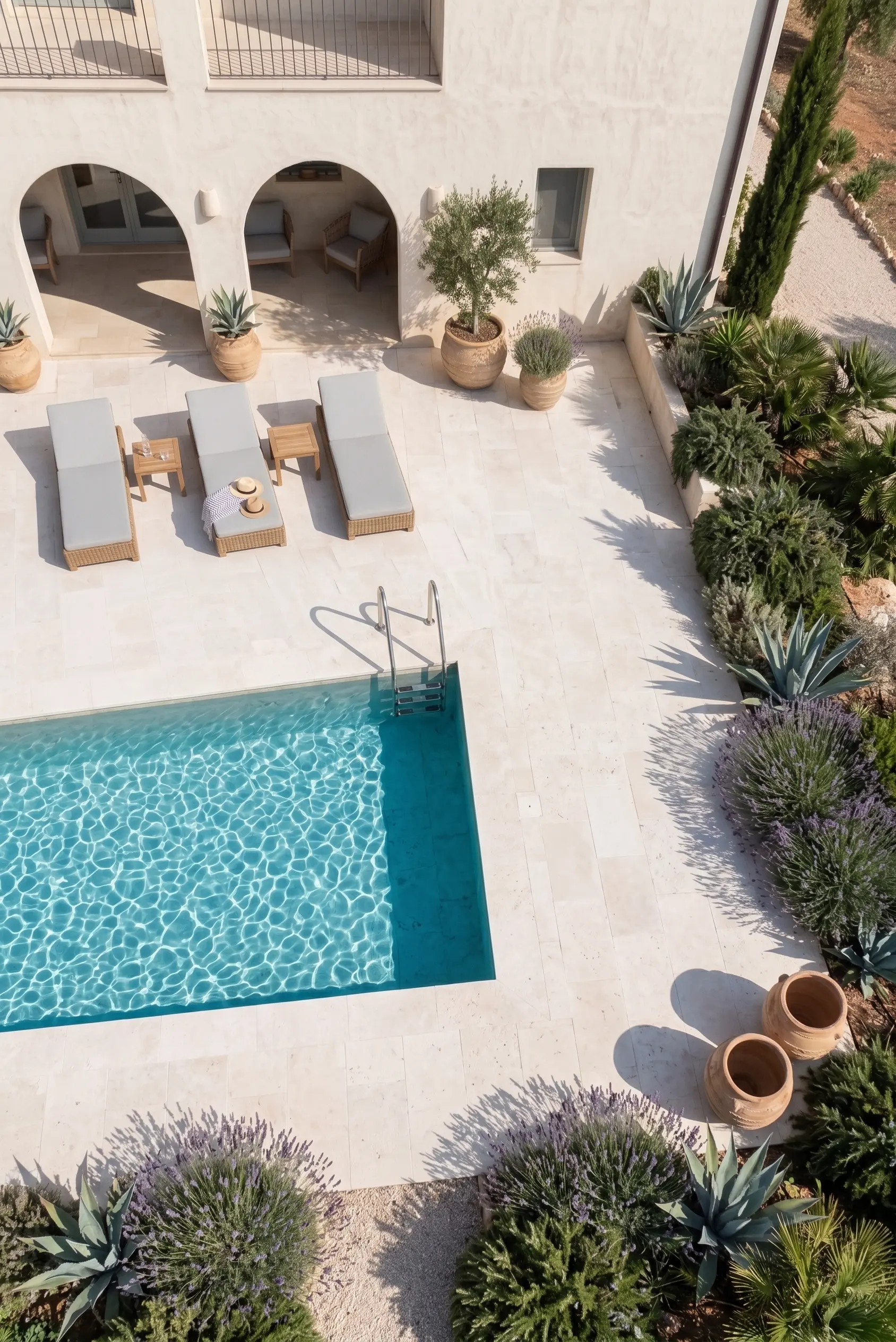
The most common pairing mistake in travertine paver color options and pairings decisions is mixing color families between horizontal and vertical planes without an intentional link. Ivory pavers with a cool-grey render wall create a temperature conflict that neither material can resolve — one of them will look wrong regardless of the light. The fix is to introduce a bridging element: a timber batten screen, a planting bed, or a coping detail in a tone that contains both warm and cool notes simultaneously. That transition material does the heavy lifting the stone cannot.
Grey travertine pavers pair cleanly with white render, light concrete, and matte black steel — materials that share the cool undertone. Walnut tones pair with warm brick, weathered timber, and bronze hardware. Ivory sits between those poles and is the most forgiving, which is why it still dominates residential pool deck specifications even as gray travertine pavers gain market share. Your safest approach is to build your palette from a single temperature family — warm or cool — and introduce contrast through texture and pattern rather than through competing stone tones.
- Ivory travertine — pairs with warm timber, terracotta, ochre-toned render, and bronze fixtures
- Walnut travertine — pairs with dark timber, weathered Corten, warm brick, and olive-toned planting
- Silver-grey travertine — pairs with white concrete, cool grey render, matte black steel, and Pinus radiata
- Mixed-tone installations work best when one color dominates and the second appears only at a defined transition zone
Applying the Travertine Paver Colors Guide on Your Project
A travertine paver colors guide ultimately resolves to one practical discipline: commit to a temperature family — warm or cool — before specifying material, and hold that discipline through every adjacent selection on the project. The color name on the invoice is a starting point, not a guarantee of what arrives; request samples, define your acceptable tone range in writing, and tie approval to a physical sample rather than a photograph. For the full sequence from color selection through to ground preparation and bedding, laying travertine step by step covers the installation decisions that determine whether your chosen palette holds up over years of service. Gray travertine pavers from Citadel Stone are frequently selected for modern pool deck designs where a cooler, neutral palette is preferred.
Related reading: Travertine Paver Cost per Square Foot Explained · How to Seal Travertine Pavers the Right Way.