
Color is the first stone decision anyone makes and the one hardest to change, yet most guides treat it as taste alone. In Jamaica, color is also physics, maintenance and mood — and choosing well means understanding all three before falling in love with a sample.
The physics vote: light wears the crown
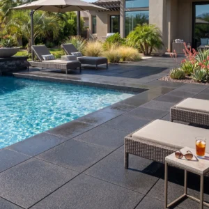
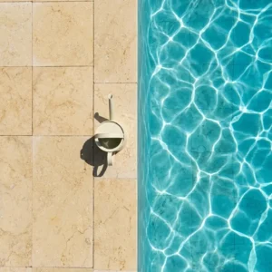
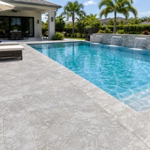
Under tropical sun, color is temperature: pale surfaces reflect solar energy while dark ones bank it. That is why white and cream limestone dominates Caribbean floors people touch:
- Pool decks
- Terraces
- Barefoot paths
Dark stone is not banned; it is budgeted, and spent where feet do not linger — borders, accents, shaded verticals, and driveway fields under tires rather than toes.
Reading undertones against Jamaican light
Island light is strong and warm, and it amplifies undertones that stay invisible in a showroom:
- A gray-white can turn steely at noon
- A cream can glow golden at five
- A beige can flatten in the overcast season
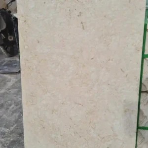
This is why the doorstep sample ritual matters: view candidates at morning, noon and golden hour, wet and dry, against your render and roof colors. The stone that wins all six viewings is the color you actually chose.
Pairing with Jamaica’s architecture
The island’s palette runs from whitewashed villas to vivid Kingston moderns and timber gingerbread heritage, and stone serves each differently: crisp white limestone extends minimalist architecture onto the ground plane; warm creams flatter traditional render and greenery; graphite basalt draws sharp frames around either. The reliable formula is one field tone plus one accent — the field agreeing with the architecture’s temperature (cool with cool, warm with warm), the accent providing the punctuation.
Absorption is the number that separates one limestone from another. The Natural Stone Institute records a range running from under one percent to over ten across the family, and notes that dolomitic stones generally carry higher density, lower absorption and better abrasion resistance — the industry variety data sets this out. That spread is why two stones sold under the same broad name can behave nothing alike underfoot.
Color and the maintenance ledger
Every tone hides some things and confesses others. Pale stone shows organic debris quickly (prompting the sweep that all stone needs anyway) but hides dust, salt film and water spotting; dark stone conceals leaves and soil yet displays every mineral watermark, pollen dusting and dried splash in raking light — one reason dark fields demand more rinsing near sprinklers and pools. Mid-tones and fossil-textured surfaces like shellstone are the camouflage champions, their natural variation absorbing the week between cleanings gracefully.
Rooms of color: zoning tones across a property
Properties read best when color zones follow use:
- Brightest tones at pool and sun terraces, where temperature is the duty
- Softer creams in courtyards and covered galleries — glow without glare
- Accent darks at driveway borders, step risers and entrance frames, where definition is the duty
Keep the number of tones to two, or three with real discipline, and repeat them everywhere. The property becomes a composition rather than a collection.
Testing color like a professional
The professional color test costs a week: samples of the two or three finalists laid where they will live, walked past daily, photographed at different hours, splashed and left to dry. Include your existing hardscape and roof in every photo. By day seven the property has voted — and because samples arrive within 3 working days, the entire decision, start to confident finish, fits inside a fortnight.
Fading, staining and the decade test
Ask of any color: what does it look like in year ten? Mineral color in natural stone is UV-stable — the pale limestone that survives Jamaican sun unfaded is the same stone Mediterranean islands have used for centuries — while dyed and tinted products audition well and fade on schedule. Staining risk runs the other way: light stone shows organic accidents until cleaned but hides mineral dulling; dark surfaces hide the wine and show the water. The decade verdict favors stone whose color is its mineralogy, maintained by the routine rather than defended by it.
Undertone pairing: a quick reference
For fast decisions with samples in hand:
- Cool white stone pairs with gray, black, glass and silver hardware
- Cream and ivory pair with timber, bronze, terracotta and green-heavy planting
- Gray mid-tones bridge both worlds and calm busy elevations
- Fossil-textured surfaces bring their own pattern and want quiet neighbors
When two candidates both work, choose the one that flatters the fixed elements you cannot change.
Color mistakes the island keeps making
Three recurring regrets, pre-empted:
- Choosing from a single small sample — variation only reads across a range set, so order range pieces and judge the family rather than the individual
- Matching a neighbor’s stone by eye from the road — their five-year weathering is not your day-one color, and the matching disciplines apply even to inspiration
- Letting interior lighting choose an exterior tone — showroom halogens flatter warm tones that read quite differently at noon
Accent placement: where the dark tone earns rent
The pair-plus-cameo rule leaves one question: where exactly the accent belongs. Three high-rent locations:
- Framing moves — borders, aprons, thresholds — where a dark line composes the pale field
- Safety moves — step risers and nosing edges — where contrast literally reads the geometry for feet and eyes
- Gravity moves — plinths, wall caps, water-feature rims — where visual weight anchors an element
Scattered dark units in a field do none of these jobs.
How a tone changes through the day
Stone color is not a fixed property, and the sample board is the worst place to learn that. The same pale limestone reads four different ways between breakfast and dinner in Jamaican light, and the version you fall for at midday is rarely the one you live with most. Morning sun from the east lifts warm undertones and flatters cream; overhead noon light flattens everything toward white and hides the texture that gives a floor its character; late afternoon rakes across the surface and brings every brushed line back; and after dark, the floor becomes whatever your lighting scheme says it is. Judge candidates at two of those moments at minimum, and pick the one that never disappoints rather than the one that peaks.
Color and the planting around it
A Jamaican garden puts more saturated green against a floor than almost any other setting, and the interaction runs both ways. Pale stone makes planting read more vividly, which is usually the intention; heavily veined or busy stone competes with foliage and both lose. Three practical notes:
- Test samples against the actual planting palette, not against a lawn — croton, bougainvillea and heliconia are far stronger neighbors than grass
- Remember that planting matures, so a floor chosen against young beds will sit in deeper shade and stronger color in five years
- Watch for staining species directly overhanging pale paving, since fruit and sap mark cream more visibly than gray
The floor is the constant in that relationship. Choose it to flatter what grows, and it will keep doing so as the garden fills in.
When the house already has a palette
Most stone decisions in Jamaica are made against an existing building rather than a blank site, which narrows the question usefully. The fixed elements — render color, roof tile, timber joinery, window frames — are expensive to change and should lead. Take a sample to the wall in daylight rather than working from a photograph, and check it against the least flattering fixed element rather than the most attractive one; if it survives beside the roof tile nobody loves, it will look right everywhere else. Where the existing palette is genuinely difficult, a gray mid-tone is the reliable bridge, because it argues with almost nothing.
Choosing stone colors for a Jamaican house
Color is the decision every guest sees and no one should notice: right, it recedes into inevitability; wrong, it introduces itself forever. Two tones, physics-first, tested on the doorstep — the sample box closes the question in a week, and the property answers it gracefully for decades. Choose the tone for the light it will actually live in.