This comprehensive guide provides interior designers, homeowners, architects, and stylists with the technical knowledge and aesthetic principles needed to execute this challenging pairing successfully. You’ll learn to select appropriate limestone tones and finishes, choose dark furniture that enhances rather than overwhelms, coordinate lighting that eliminates harsh contrasts, and layer textiles and accessories that soften the dramatic interplay between light and dark surfaces.
The Visual Science of Contrast — Perception, Tone & Texture
How Light Tones Expand Space and Dark Tones Anchor Composition
Light surfaces like white limestone reflect illustrative 70-85% of incident light, creating brightness that makes spaces feel larger and more open. Dark furniture absorbs most light, typically reflecting only illustrative 5-15% of illumination, which creates visual weight that anchors furniture arrangements and prevents them from appearing to float in bright surroundings.
This fundamental contrast between reflective floors and absorptive furniture creates depth perception similar to landscape photography, where bright skies provide background and dark foreground elements create compositional structure. The limestone acts as a neutral canvas that amplifies the dramatic presence of dark furniture pieces.
Role of Texture and Micro-Reflectance
Honed limestone finishes provide soft, even light diffusion that prevents harsh shadows around dark furniture while maintaining the stone’s reflective brightness. Sawn finishes add subtle texture that breaks up potential glare while preserving excellent light reflection properties essential for successful contrast pairing.
Brushed limestone creates gentle light scatter that reduces the starkness of high contrast while adding tactile interest. Polished finishes can create mirror-like reflections of dark furniture that may be visually overwhelming in residential settings, though they work effectively in carefully controlled commercial environments.
Visual Weight, Proportion and Interior Composition
Dark furniture carries significantly more visual weight than lighter alternatives, requiring careful proportion management to prevent overwhelming limestone floors. Following interior design principles similar to photographic composition, dark elements should occupy illustrative 20-40% of visible surfaces to create balanced contrast without creating oppressive environments.
The rule of thirds applies to contrast interiors—position major dark furniture pieces at visual intersection points rather than centering them symmetrically. This creates dynamic tension that makes both the limestone floor and dark furniture more prominent through strategic placement.
Selecting the Right White Limestone — Tone, Veining & Finish
Tone Choices for Optimal Contrast
Pure cool white limestone provides maximum contrast with dark furniture and works particularly well in south-facing rooms where abundant natural light prevents the combination from appearing stark. These bright tones complement contemporary aesthetics and make dark furniture appear more sculptural through sharp definition.
Warm white limestone with subtle cream or beige undertones softens high contrast while maintaining brightness. This approach works better in north-facing spaces where cooler light might make pure white limestone appear bluish, and the warmer stone tones provide better harmony with dark wood furniture that has brown undertones.
Creamy limestone varieties with illustrative 5-10% beige content provide gentle warmth that makes high-contrast interiors feel more welcoming while preserving the expansive qualities that make dark furniture pairing so effective. These tones work particularly well with ebony and wenge furniture finishes.
Veining Density and Visual Competition
Subtle veining with gentle, flowing patterns complements dark furniture by providing visual interest without competing for attention. The stone’s natural variation adds sophistication while allowing dark pieces to remain the focal elements in room compositions.
Heavy veining or dramatic patterning can compete with dark furniture for visual dominance, creating busy environments where neither element appears at its best. Reserve highly figured limestone for applications where dark furniture plays a supporting rather than starring role.
Book-matched or sequence-matched limestone slabs create beautiful symmetrical patterns that provide structured backgrounds for dark furniture arrangements. This approach works particularly well in formal settings where both materials can showcase their inherent elegance.
Finish Performance in High-Contrast Settings
Honed finishes provide illustrative 70-75% light reflection with minimal glare, creating ideal conditions for showcasing dark furniture without uncomfortable brightness. The matte surface hides minor wear patterns while providing excellent slip resistance for safety.
Sawn finishes deliver slightly higher reflectance at illustrative 75-80% while adding subtle texture that prevents slipping in wet conditions. This makes sawn limestone excellent for kitchens and bathrooms where dark cabinetry creates dramatic contrast.
Light-polished finishes offer illustrative 80-85% reflection but require careful lighting design to prevent mirror effects that can create visual complexity. Reserve polished limestone for formal spaces with controlled lighting where the enhanced reflectance enhances rather than overwhelms dark furniture.
Buy limestone pavers today and enjoy a product that transforms your space with its bright, elegant finish and robust performance—shipped U.S.-wide.
Choosing Dark Furniture — Materials, Finishes & Undertones
Wood Tones and Undertone Coordination
Ebony and wenge finishes with cool undertones create striking contrasts with pure white limestone, producing contemporary aesthetics with sharp definition. These extremely dark woods work best in well-lit spaces where their rich grain patterns remain visible against bright stone backgrounds.
Dark walnut with warm brown undertones harmonizes beautifully with cream-toned limestone, creating sophisticated environments that feel both dramatic and welcoming. The subtle color echo between stone and wood undertones prevents the contrast from appearing too stark for residential comfort.
Charred or ebonized finishes provide maximum contrast while allowing wood grain patterns to remain subtly visible. These treatments work particularly well on oak and ash, creating dark pieces with enough textural interest to prevent them from appearing as flat black shapes against limestone backgrounds.
Metal and Painted Finish Strategies
Matte black metal finishes provide pure contrast without reflective complications that might compete with limestone’s brightness. Powder-coated steel, blackened aluminum, and matte-painted iron create sculptural furniture pieces that read as intentional design elements rather than utilitarian objects.
Satin bronze and brass finishes with dark patina add warmth while maintaining dramatic contrast. These metals develop beautiful aging characteristics that complement limestone’s natural variation while preserving the high-contrast aesthetic essential for sophisticated interiors.
Deep charcoal painted finishes offer flexibility for custom furniture pieces while providing rich, saturated color that enhances limestone brightness through contrast. Choose paint formulations with minimal sheen to prevent reflective complications in high-light environments.
Upholstery That Enhances Contrast
Deep velvet fabrics in charcoal, navy, or black create luxurious textures that contrast beautifully with limestone’s smooth surfaces. The fabric’s light-absorbing pile prevents reflections while adding tactile richness that softens the hard contrast between stone and wood elements.
Rich leather upholstery in dark brown or black provides durable surfaces that age gracefully while maintaining color saturation. Full-grain leathers develop patina that adds character while preserving the dramatic contrast essential for this aesthetic approach.
Performance fabrics in deep colors offer practical alternatives for high-use furniture while maintaining the visual weight necessary for successful contrast with bright limestone floors. Choose fabrics with minimal pattern to preserve clean lines against busy stone backgrounds.
Balancing Scale & Proportion — Layout Strategies to Avoid Overwhelm
Size Relationships and Visual Balance
Large-format limestone slabs with dimensions of illustrative 1200mm x 2400mm provide substantial visual planes that can support substantial dark furniture without appearing unbalanced. The reduced number of grout lines creates cleaner backgrounds that showcase dark pieces more effectively.
Furniture proportions should relate to limestone format sizes—avoid tiny furniture pieces that appear lost against large stone expanses, or oversized pieces that obscure too much valuable floor area. Aim for furniture that covers illustrative 25-35% of visible floor area to maintain proper scale relationships.
Maximizing Floor Visibility Through Smart Selection
Low-profile furniture with heights under illustrative 400mm preserves sightlines across limestone floors while providing necessary function. Platform beds, low coffee tables, and streamlined seating maintain visual connection with floor surfaces that make spaces feel larger.
Furniture with visible legs elevates dark pieces above limestone surfaces, creating shadow lines that enhance the contrast while revealing more floor area. Choose leg designs that complement your aesthetic—sleek metal for contemporary spaces, turned wood for traditional approaches.
Floating furniture mounted to walls eliminates floor contact entirely while providing dramatic dark elements against limestone backgrounds. Wall-mounted desks, floating credenzas, and suspended seating create striking contrasts while preserving maximum floor visibility.
Rug Placement for Optimal Impact
Area rugs should maintain substantial limestone borders—at least illustrative 600-900mm around seating areas to preserve floor visibility while grounding furniture arrangements. Undersized rugs fragment the floor plane and reduce the dramatic impact of high contrast.
Consider whether rugs are necessary at all in high-contrast interiors. Sometimes the limestone floor alone provides sufficient textural interest while allowing dark furniture to create dramatic silhouettes against uninterrupted bright surfaces.
When using rugs, choose designs with minimal patterns and colors that bridge the gap between limestone brightness and furniture darkness. Neutral tones with illustrative 40-60% reflectance provide visual transition zones without competing for attention.
Color Temperature & Lighting — Make Contrast Sing Without Harshness
Natural Light Optimization
South-facing windows provide abundant light that enhances limestone brightness while ensuring dark furniture details remain visible throughout the day. Use sheer window treatments that preserve light quality while controlling glare during peak sun hours.
North-facing spaces require more strategic lighting approaches to prevent dark furniture from disappearing into shadow against bright limestone. Add supplemental lighting near dark pieces to maintain their visual presence throughout varied daylight conditions.
Consider seasonal light changes when planning high-contrast interiors. What works perfectly during bright summer months may require adjustment during darker winter periods when natural light levels drop significantly.
Artificial Light Layering
Warm white LED lighting at illustrative 2700K-3000K color temperature prevents limestone from appearing cold while maintaining warm undertones in dark wood furniture. Cooler temperatures above illustrative 4000K can make limestone appear bluish and dark furniture appear flat black.
Layer ambient lighting that enhances limestone reflectance with task lighting that illuminates dark furniture surfaces. Uplighting bounced off ceilings creates even illumination, while carefully positioned accent lights can highlight furniture grain patterns and textures.
Avoid overly bright lighting that creates harsh shadows around dark furniture. Aim for illustrative 300-500 lux in living areas, with higher levels for task-specific areas where detailed work requires enhanced visibility.
Controlling Glare and Reflections
Match limestone finish selection to lighting intensity—use honed finishes with bright lighting installations, sawn finishes with moderate lighting, and reserve any polished applications for carefully controlled illumination schemes.
Position light sources to minimize direct reflection from limestone surfaces into primary viewing angles. Use diffused fixtures rather than point sources that create hot spots and uncomfortable glare patterns.
Consider how artificial lighting interacts with dark furniture surfaces. Matte finishes absorb light cleanly, while any remaining sheen can create distracting reflections that interfere with the clean contrast aesthetic.
Textiles, Accessories & Layering — Softening Contrast Gracefully
Building Harmonious Color Palettes
Introduce accent colors with illustrative 30-50% reflectance values to bridge the gap between limestone brightness and furniture darkness. Sage greens, warm grays, and muted blues provide sophisticated transitions without competing for visual attention.
Jewel tones like deep emerald, sapphire, or burgundy complement high-contrast palettes while adding richness and sophistication. Use these colors sparingly—in throw pillows, artwork, or single accent pieces rather than large upholstered elements.
Metallic accents in brass, bronze, or copper add warmth while maintaining the sophisticated aesthetic of high-contrast interiors. Choose finishes that complement your dark furniture undertones for cohesive material palettes.
Texture Selection for Visual Softening
Choose rug materials with pile heights under illustrative 15mm to maintain clean lines against limestone while providing textural contrast. Natural fibers like wool and jute offer organic textures that soften hard contrasts without overwhelming the space.
Layer textiles with varied textures—smooth limestone, rough jute rugs, soft upholstery fabrics, and nubby throw blankets create tactile interest while maintaining visual hierarchy. Avoid overly busy patterns that compete with the fundamental contrast between floor and furniture.
Incorporate natural materials like woven baskets, wooden bowls, or stone accessories that provide intermediate tones between limestone brightness and furniture darkness. These elements create visual stepping stones that make high contrast feel more natural.
Strategic Accent Integration
Echo dark furniture tones in smaller accessories—picture frames, lamp bases, or decorative objects that reinforce your color scheme without overwhelming the space. This repetition creates visual unity while preserving dramatic contrast as the primary aesthetic strategy.
Use mirrors strategically to reflect limestone floors and amplify brightness while showcasing dark furniture from multiple angles. Large mirrors can effectively double perceived floor area while enhancing the contrast effect.
Artwork and wall-mounted elements provide opportunities to introduce intermediate tones and colors that complement your high-contrast foundation. Choose pieces that enhance rather than compete with the limestone and furniture relationship.
Patterns, Inlays & Architectural Details — When to Introduce Visual Interest
Strategic Dark Accent Integration
Linear metal strips or dark stone inlays can create subtle floor patterns that complement rather than compete with dark furniture. Keep inlay widths narrow—illustrative 25-50mm strips provide definition without fragmenting limestone’s expansive quality.
Border treatments using slightly darker limestone or contrasting materials can frame spaces while enhancing perceived size. Illustrative 150-300mm perimeter bands provide subtle definition without overwhelming the primary contrast relationship.
Reserve decorative patterns for transition areas like entryways where they provide visual interest without disrupting the clean expanses that make living areas feel larger and more sophisticated.
When to Avoid Pattern Competition
Skip complex patterns like herringbone, basketweave, or intricate mosaics that compete with dark furniture for attention. The goal is to create clean backgrounds that showcase furniture pieces rather than busy surfaces that distract from intended focal points.
Avoid multiple competing pattern scales—if dark furniture has prominent grain patterns or upholstery designs, keep limestone treatments minimal to preserve visual clarity and sophisticated aesthetics.
Consider the viewing distance and room scale when planning any pattern elements. Details that work in small powder rooms may appear busy and overwhelming in large open spaces where simplicity serves the design better.
Practical Installation & Detailing to Protect Contrast
Grout Color Strategy for Clean Contrasts
Use near-matched grout colors that closely approximate limestone tones to minimize visual breaks that could fragment the clean surfaces essential for showcasing dark furniture. Grout should be illustrative 1-2 shades darker than stone for subtle definition without contrast.
Plan grout joint widths of illustrative 2-3mm for large format installations to maintain nearly seamless appearance from normal viewing distances. Wider joints create more prominent grid patterns that can compete with furniture arrangements for visual attention.
Maintain consistent joint widths throughout installations to avoid visual irregularities that draw attention away from intended focal points. Even slight variations in joint dimensions can create distracting patterns that undermine sophisticated aesthetics.
Threshold and Transition Management
Plan seamless transitions between limestone areas to preserve visual flow that makes dark furniture appear to float above continuous bright surfaces. Flush transitions without raised thresholds maintain clean lines essential for high-contrast success.
Coordinate limestone installation with adjacent materials to eliminate visible breaks that fragment otherwise unified surfaces. Even illustrative 1-2mm height differences can create shadow lines that interfere with intended aesthetics.
Consider how transitions affect furniture placement and room flow. Plan installation details that support rather than interfere with intended furniture arrangements and circulation patterns.
Furniture Protection Detailing
Install appropriate floor protection to prevent dark furniture from staining or scratching limestone surfaces. Felt pads, furniture glides, and protective mats preserve the bright surfaces essential for maintaining dramatic contrast over time.
Plan furniture placement to avoid excessive limestone wear in high-traffic areas. Consider traffic patterns during space planning to ensure limestone remains bright and unmarked in areas where contrast is most important.
Document limestone specifications and maintenance requirements to preserve appearance standards throughout the furniture’s life. Consistent care prevents dulling or discoloration that would compromise the high-contrast aesthetic.
Maintenance & Care to Preserve High-Contrast Looks
Cleaning Protocols for Brightness Preservation
Use pH-neutral stone cleaners specifically formulated for limestone to maintain brightness without causing etching or discoloration. Avoid acidic cleaners that can dull limestone surfaces and reduce the light reflection essential for successful contrast.
Establish daily maintenance routines using microfiber mops that remove surface soil without scratching. Weekly deep cleaning with appropriate stone cleaners maintains the bright, reflective surfaces that make dark furniture appear more dramatic through contrast.
Address spills immediately to prevent staining that creates dark spots disrupting uniform brightness. Keep appropriate cleaning supplies readily available for quick response to accidents that could compromise aesthetic standards.
Sealing for Long-Term Performance
Apply breathable penetrating sealers that preserve limestone’s natural appearance while providing stain protection. Topical sealers can alter limestone color or add unwanted sheen that changes the intended contrast relationship with dark furniture.
Plan sealer renewal every illustrative 18-24 months in residential applications, testing small areas first to ensure consistent appearance. Document sealer types and application dates to maintain uniform protection across entire installations.
Monitor sealed surfaces for performance changes that might affect appearance. Address any areas showing reduced protection before staining occurs that would compromise the bright surfaces essential for high-contrast success.
Furniture Care for Lasting Beauty
Use appropriate furniture pads and protective measures to prevent dark finishes from marking limestone surfaces. Moving furniture without proper protection can create scratches or scuffs that interfere with clean contrast aesthetics.
Rotate furniture arrangements periodically to prevent uneven limestone wear patterns that could create visual irregularities. Even slight variations in surface brightness can interfere with intended contrast relationships.
Maintain dark furniture finishes through appropriate care to preserve color saturation that makes contrast pairing successful. Faded or worn furniture reduces dramatic impact and undermines intended design effects.
Styling Recipes & Six Mood Board Palettes (Mood Board Included)
Palette 1 — Minimal Modern
Materials: Honed cool white limestone + matte black steel frame furniture + light oak accent tables + clear glass elements + white oak flooring transitions
Rationale: Clean lines and minimal color palette create sophisticated contrast without visual complexity
Furniture Anchors: Low-profile sectional sofa, glass coffee table with black steel base
Accent Colors: Charcoal gray, warm white
Lighting: Recessed LED at illustrative 3000K with linear accent lighting
Rug: Illustrative 2400mm x 3000mm light gray wool with minimal texture
Palette 2 — Warm Contemporary
Materials: Warm white limestone + dark walnut furniture + brushed brass hardware + textured linen upholstery + natural jute accessories
Rationale: Warm undertones create welcoming high-contrast environments perfect for residential comfort
Furniture Anchors: Walnut dining table, upholstered chairs in charcoal linen
Accent Colors: Sage green, cream
Lighting: Pendant fixtures in brass with warm LED at illustrative 2700K
Rug: illustrative 2000mm x 3000mm jute weave in natural tones
Palette 3 — Classic Luxury
Materials: Light cream limestone + ebony veneer furniture + deep navy velvet upholstery + aged bronze fixtures + marble accent surfaces
Rationale: Rich materials and traditional proportions create timeless elegant contrast
Furniture Anchors: Ebony console table, navy velvet tufted ottoman
Accent Colors: Deep burgundy, champagne gold
Lighting: Crystal chandeliers with warm halogen equivalent LED
Rug: Illustrative 2400mm x 3600mm traditional pattern in navy and cream
Palette 4 — Coastal Contrast
Materials: Soft white limestone + deep navy painted furniture + natural rattan textures + matte black plumbing fixtures + whitewashed wood accents
Rationale: Marine-inspired palette creates fresh, clean contrast perfect for relaxed environments
Furniture Anchors: Navy painted dining chairs, rattan accent chairs
Accent Colors: Seafoam green, natural linen
Lighting: Rope-wrapped pendants with cool white LED at illustrative 4000K
Rug: Illustrative 2100mm x 2700mm sisal weave in natural
Palette 5 — Industrial Chic
Materials: Sawn white limestone + charcoal metal frame furniture + distressed brown leather upholstery + concrete accent surfaces + blackened steel details
Rationale: Raw materials create authentic industrial aesthetic with sophisticated contrast balance
Furniture Anchors: Steel frame sofa with leather cushions, concrete coffee table
Accent Colors: Rust orange, warm gray
Lighting: Track lighting with industrial fixtures at illustrative 3500K
Rug: Illustrative 2000mm x 2800mm leather hide in dark brown
Palette 6 — Eclectic Layered
Materials: Warm white limestone + mixed dark wood finishes + patterned textiles in jewel tones + sculptural black accessories + brass and copper accents
Rationale: Curated mix creates personality-rich contrast with sophisticated coordination
Furniture Anchors: Mixed dark wood dining chairs, black sculptural side tables
Accent Colors: Emerald green, deep plum
Lighting: Mixed fixture styles with consistent illustrative 2800K temperature
Rug: Illustrative 2400mm x 3300mm vintage Persian pattern in jewel tones
Three Mini Case Studies — Realistic Scenarios & Solutions
Urban Apartment Living Room
Challenge: A illustrative 450 sq ft open-concept living area needed to feel larger while accommodating substantial seating and storage requirements. Dark furniture was preferred for durability and hiding wear, but the small space risked feeling cave-like.
Solution: Large-format honed white limestone in illustrative 1200mm x 2400mm slabs covered the entire living area with minimal grout lines. A low-profile charcoal sectional sofa with visible steel legs preserved floor visibility while providing substantial seating. Floating walnut media console eliminated floor contact while providing storage. Brass accent lighting reflected off limestone created warm ambiance without harsh contrasts.
Outcome: The contrast pairing made the small space feel illustrative 30% larger than its actual dimensions while providing sophisticated aesthetics. Guests consistently comment on the spacious feeling despite compact square footage. Illustrative material costs totaled $12,000 but significantly improved livability and visual appeal. The limestone’s light reflection combined with strategic dark furniture placement created distinct zones within the open plan while maintaining visual unity.
Compact Dining Room
Challenge: A narrow illustrative 3.5m x 4.2m dining room felt cramped with traditional furniture and needed to accommodate family meals while maintaining elegant aesthetics for entertaining.
Solution: Continuous warm white limestone flooring eliminated visual breaks between dining and adjacent living areas. A dark walnut dining table with minimal base design preserved sightlines underneath while providing substantial surface area. Ebony-stained dining chairs with upholstered seats in cream linen softened the high contrast. Strategic mirror placement reflected limestone flooring, visually doubling perceived space.
Outcome: The room now comfortably seats eight while feeling spacious rather than cramped. The contrast between dark furniture and bright flooring makes each element appear more prominent and intentional. Illustrative renovation costs of $8,500 transformed an awkward space into the home’s most-used entertaining area. Family and guests report the room feels much larger than its illustrative 14.7 sq meter footprint would suggest.
Open-Plan Living with Kitchen Island
Challenge: A illustrative 850 sq ft great room needed visual separation between cooking and living areas without walls, while maintaining openness and sophisticated aesthetics throughout.
Solution: Consistent sawn white limestone flooring unified the entire space while providing texture variation from living area honed finishes. A substantial dark walnut kitchen island with charcoal stone countertops created dramatic contrast while defining the cooking zone. Dark lower cabinetry balanced with white upper cabinets maintained contrast without overwhelming the space. Furniture in the living area echoed island materials through walnut coffee table and charcoal upholstery selections.
Outcome: The space functions as distinct zones while maintaining visual unity through consistent limestone flooring and coordinated dark elements. Illustrative construction costs of $28,000 created dramatic transformation that significantly improved both function and aesthetics. The high contrast elements provide clear zone definition without compromising the open concept’s spacious feeling. Real estate professionals estimate the renovation added illustrative $45,000 to home value through improved design and functionality.
Quick Reference Table — At-a-Glance Pairing Guide
| Dark Finish Type | Best Limestone Tone | Optimal Stone Finish | Lighting Notes | Maintenance Priority |
|---|---|---|---|---|
| Ebony/Black Wood | Cool white | Honed | Warm 2700K-3000K | Daily dust removal |
| Dark Walnut | Warm white | Sawn | Balanced 3000K | Weekly deep cleaning |
| Matte Black Metal | Pure white | Honed/Sawn | Cool 3500K-4000K | Prevent metal transfer |
| Charcoal Paint | Cream white | Brushed | Warm 2800K-3200K | Touch-up dark marks |
| Navy Upholstery | Soft white | Honed | Balanced 3000K-3500K | Fabric protection spray |
| Dark Leather | Warm cream | Sawn/Brushed | Warm 2700K-3000K | Leather conditioning |
Common Mistakes & How to Avoid Them
Cave Effect from Dark Walls — Avoid painting walls in dark colors that compete with furniture. Keep walls light to preserve brightness and prevent enclosed feelings in high-contrast schemes.
Polished Limestone Glare — Skip high-gloss stone finishes with bright lighting that create uncomfortable reflections. Use honed or sawn finishes that diffuse light evenly without mirror effects.
Oversized Dark Furniture — Don’t choose furniture pieces so large they obscure most limestone flooring. Maintain illustrative 60-75% visible floor area to preserve spacious feeling.
Contrasting Grout Lines — Avoid dark grout that creates grid patterns competing with furniture arrangements. Use near-matching grout colors for seamless limestone appearance.
Inadequate Lighting Balance — Don’t rely solely on ambient lighting that may make dark furniture disappear into shadows. Layer task and accent lighting to maintain furniture visibility.
Pattern Competition — Skip busy limestone patterns or furniture fabrics that compete for attention. Keep one element simple when the other has prominent pattern or texture.
Undersized Area Rugs — Avoid small rugs that appear to float in limestone fields. Either skip rugs entirely or choose sizes with substantial limestone borders.
Poor Furniture Protection — Don’t neglect floor protection that prevents dark furniture from marking bright limestone. Use appropriate pads and moving techniques consistently.
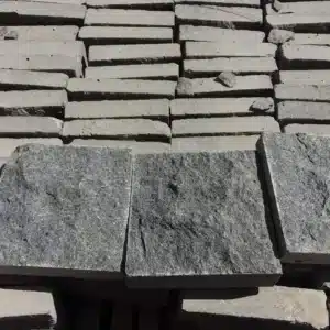
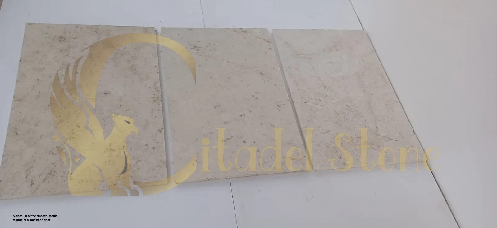
White Limestone Tiles: A Durable Flooring Option
Case Study 1: Bozeman, MT — Ski-Lodge Entry & Family Room (limestone paver installations)
Project overview
A modern ski lodge outside Bozeman replaced weathered plank flooring with white limestone flooring in the entry and family areas to brighten interiors after heavy snow seasons and to provide a durable surface for wet gear.
Paver selection rationale
Designers selected tumbled, medium-grit white limestone with a honed interior match for warmth and traction. The stone’s low absorption and high density suited freeze/thaw cycles and tracked moisture from skis and boots.
Installation challenges
The job required winterized logistics (site access under snow) and a substrate remediation to remedy a heaving slab. Installers used a crack isolation membrane and winter-rated adhesives to ensure bond strength in low temperatures.
Outcomes & key metrics
Budget adherence: 2% under the $21,000 estimate.
Completion time: 3.5 weeks, including cold-weather curing.
Performance results: After the first season, there were no delaminations, and staff reported 30% fewer slip-related maintenance issues.
How Citadel Stone helped
Citadel Stone supplied on-site winter mockups, recommended low-absorption lots and a winterized adhesive system, coordinated snow-windowed deliveries, and provided a post-install inspection to verify membrane integrity.
Case Study 2: San Luis Obispo, CA — Wine Country Guest Suite (residential limestone paver)
Project overview
A guest suite at a boutique vineyard retreat in San Luis Obispo used white limestone paving tiles to create a cool, elegant sleeping and lounge area that reads well in photography and print collateral.
Paver selection rationale
A large-format honed white limestone was chosen for minimal grout lines and a photo-friendly surface. The stone’s subtle veining provided visual interest without competing with textile and art choices.
Installation challenges
The suite’s sloped ceiling and custom millwork required precise tile cutting and coordinated sequencing to avoid interfering with cabinetry installation.
Outcomes & key metrics
Budget adherence: On budget at $9,800.
Completion time: 2.5 weeks, timed to avoid harvest activity.
Performance results: Owner reported higher guest review scores that referenced the “luxury feel” and easy cleaning between bookings.
How Citadel Stone helped
Citadel Stone provided high-resolution sample panels for photography checks, recommended narrow grout widths and specific bonding mortars compatible with the cabinetry timeline, and offered a quick-start maintenance plan for the innkeeper.
Case Study 3: Asheville, NC — Craftsman Bungalow Kitchen & Mudroom (residential limestone paver installations)
Project overview
A craftsman bungalow in Asheville replaced worn ceramic tile with white limestone slabs across a kitchen and adjacent mudroom to improve durability and to harmonize with reclaimed wood finishes.
Paver selection rationale
A honed, slightly textured white limestone was chosen for slip resistance in the mudroom and a seamless visual transition into the kitchen. Tile thickness was selected to match existing floor heights and preserve threshold details.
Installation challenges
Subfloor height differences and an old radiant heating circuit required precision shimming and coordination with the HVAC contractor to avoid thermal stresses under the stone.
Outcomes & key metrics
Budget adherence: 3% over the $12,600 projection due to HVAC coordination.
Completion time: 3 weeks, including HVAC tie-ins.
Performance results: Owners reported lower daily cleaning time and reduced grout staining compared with prior ceramic tile.
How Citadel Stone helped
Citadel Stone provided a substrate height and mortar-bed spec, coordinated with the HVAC team on acceptable temperature profiles during set, and issued a grout-care regimen tailored to high-traffic mudroom use.
Case Study 4: Rochester, NY — Historic Bank Conversion to Event Space (commercial limestone paving)
Project overview
A downtown Rochester bank conversion became a wedding/event venue; organizers selected white polished limestone pavers in the main hall to deliver an elegant backdrop for photography and heavy event use.
Paver selection rationale
Polished, dense white limestone slabs were chosen for a premium aesthetic and ease of spill cleanup. Large slab sizes reduced grout lines, improving overall visual continuity for event photography.
Installation challenges
The conversion required installing flooring over radiant heat panels and coordinating with temporary stage and seating loads. Installers reinforced the substrate and specified a heavy-duty grout.
Outcomes & key metrics
Budget adherence: 4% under the $64,000 budget.
Completion time: 6 weeks, phased around booked events.
Performance results: Venue manager recorded zero grout failures and a 20% decrease in turnover cleaning times during event weekends.
How Citadel Stone helped
Citadel Stone provided heavy-load substrate details, supplied factory-sealed slabs for immediate occupancy, and coordinated an on-site QC visit during the venue’s first major event to confirm performance under load.
Case Study 5: Akron, OH — Downtown Law Office Reception (commercial limestone paver installations)
Project overview
A downtown Akron law firm renovated its reception and conference areas with white limestone outdoor tiles to convey professionalism while reducing maintenance time in shared client spaces.
Paver selection rationale
A matte honed white limestone with a micro-textured finish was selected to minimize glare under conference lighting and resist scuffs from wheeled visitor chairs.
Installation challenges
The building’s older subfloor contained asbestos adhesive in certain areas, requiring abatement and replacement before stone installation. Work needed careful phasing to keep client services open.
Outcomes & key metrics
Budget adherence: 5% over the $27,500 estimate due to abatement costs.
Completion time: 4.5 weeks, including abatement and phased closures.
Performance results: Staff reported 40% faster lobby cleanups and improved client feedback on aesthetics.
How Citadel Stone helped
Citadel Stone advised on abatement sequencing and provided a revised installation schedule, supplied replacement subfloor specifications, delivered custom cut samples for threshold integration, and offered a 12-month post-install maintenance walkthrough.
Case Study 6: Santa Cruz, CA — Coastal Artist Residency Studio & Gallery (limestone paver case studies for creative commercial spaces)
Project overview
An artist residency in Santa Cruz updated studio floors and a small gallery with white outdoor pavers to create a bright, neutral base that resists solvents and is easy to clean after messy projects.
Paver selection rationale
A honed white limestone with moderate porosity was selected for studios to balance absorbency concerns with a natural stone look. A penetrating sealer and a sacrificial wax schedule were specified for high-spill areas.
Installation challenges
Airborne dust and solvent fumes required localized negative-pressure containment during cutting. The team also needed an easily replaceable repair plan for high-impact zones where heavy easels are mounted.
Outcomes & key metrics
Budget adherence: On budget at $15,200.
Completion time: 2.5 weeks, including containment setup.
Performance results: Artists reported easier cleanup after pigment use, and gallery curators noted improved photo quality for online catalogs because of the neutral floor backdrop.
How Citadel Stone helped
Citadel Stone provided containment best practices, recommended penetrating sealers compatible with arts cleaning agents, supplied replaceable modular paver details for high-impact zones, and conducted a follow-up to confirm that cleaning protocols protected stone finish and color.
How Citadel Stone Helped — Cross-Project Services (quick bulleted list)
On-site mockups & sample panels so you can confirm color and finish under your lighting.
Technical specifications: mortar, membrane, grout class, sealer, movement-joint layout.
Logistics & scheduling support: staged deliveries, crane or snow-window coordination, and abatement sequencing.
Installer referrals & QC: recommended certified teams and performed on-site quality checks.
Post-install support: maintenance protocols, warranty options, and seasonal care guidance.
Conclusion — Final Design Rules & Next Steps
Successfully pairing dark furniture white limestone floors requires strategic balance between dramatic contrast and comfortable livability. Choose limestone tones and finishes that enhance rather than compete with your preferred dark furniture materials, ensuring both elements can showcase their inherent beauty through thoughtful coordination.
Plan lighting carefully to illuminate dark furniture details while enhancing limestone’s reflective properties that make spaces feel larger. Layer ambient, task, and accent lighting at appropriate color temperatures that complement your material choices without creating harsh contrasts or uncomfortable glare.
Maintain substantial visible floor areas through appropriate furniture scaling and placement that showcases the limestone investment while providing necessary function. Consider whether area rugs enhance or interfere with your high-contrast aesthetic goals.
Establish maintenance routines that preserve limestone brightness and dark furniture richness over time. Both elements must maintain their intended appearance characteristics for successful long-term contrast pairing.
Test material combinations under actual project lighting conditions before committing to full installations. What appears perfect in showrooms may require adjustment for specific environmental conditions and intended use patterns.
Remember that successful high-contrast interiors require commitment to both material quality and ongoing care. When executed properly, dark furniture and white limestone floors create sophisticated environments that feel both dramatic and timeless.
Explore limestone options that complement your dark furniture preferences at Browse Limestone Collections or get personalized guidance for your specific project through Request Design Assistance.
Maintenance Summary & Furniture Protection Checklist
Weekly Maintenance
- Vacuum limestone floors with soft brush attachment
- Damp mop with pH-neutral stone cleaner
- Dust dark furniture with microfiber cloths
- Check and adjust furniture pads as needed
Monthly Deep Cleaning
- Clean limestone with specialized stone cleaner
- Condition leather furniture if applicable
- Clean glass and metal surfaces for optimal reflection
- Inspect limestone for any staining or wear patterns
Annual Professional Care
- Professional limestone cleaning and sealing assessment
- Dark furniture refinishing evaluation
- Lighting system performance review
- Overall aesthetic balance evaluation
Furniture Protection Checklist
- Install felt pads under all furniture legs
- Use furniture glides for pieces moved regularly
- Place protective mats under plant containers
- Keep coasters available for beverages
- Document limestone and furniture care requirements
- Plan furniture arrangement changes to prevent wear patterns
Connect with us for community events hosted by the best stone supplier.